Essential gray is a popular neutral paint color that works well in many rooms of the home. As a versatile shade, essential gray can take on different undertones depending on the light it is viewed in and the colors it is paired with. Determining the undertones of essential gray can help you better understand how to use this color effectively in your home.
What are undertones?
Undertones refer to the subtle hints of color that are present in what appears to be a neutral shade. Most grays have blue, green, purple, brown, or red undertones that affect the way the color is perceived.
Cool undertones like blue and green make a gray appear crisp and airy. Warm undertones like red and brown give a cozy, earthy feeling to gray. Identifying the undertones helps you predict how the gray will look alongside other colors and materials in a space.
How lighting affects undertones
The undertones of any gray paint color can shift dramatically depending on the type of lighting in a room. Natural daylight often brings out the coolest undertones. Incandescent bulbs and candles make grays look warmer. Cool white fluorescent lights have a blue cast that enhances cool undertones.
The direction of the light matters too. North-facing rooms with indirect sun amplify cool undertones. South-facing rooms with lots of direct sun play up warmth in grays. Always sample paint colors on the wall at different times of day to see how the lighting affects the undertones.
Essential gray undertones
Essential gray by Behr paints is described as a soft, blendable gray that coordinates with any color scheme. With an LRV of 54, it reflects light moderately and adapts well to various types of lighting.
In general, essential gray has subtle, neutral undertones. Unlike dramatic gray colors with bold blue, green, or brown hints, essential gray shifts only slightly between cool and warm.
Here are the predominant undertones essential gray displays:
- Slightly cool in north light or under fluorescent lighting
- Slightly warm in incandescent light at night
- Neutral to barely warm in direct sunlight
The neutrality of essential gray makes it highly flexible. Different pairings and lighting transforms its subtle undertones.
Coordinating with essential gray
Essential gray has enough neutral adaptability to complement most color schemes. Here are suggestions for coordinating essential gray with other colors to bring out certain undertones:
| Colors to pair with essential gray | Resulting undertones |
|---|---|
| Crisp white, pale blue | Enhances cool undertones |
| Warm white, greige, camel | Brings out subtle warmth |
| Sage green, mossy green | Adds slight greenness |
| Soft pink, terra cotta | Hints at red undertones |
Don’t be afraid to mix essential gray with a variety of colors. The natural adaptability of this gray allows it to blend seamlessly without clashing.
Using essential gray in home spaces
The barely-there coolness of essential gray makes it suitable for almost any room in your home. Here are some ideas for using essential gray to enhance different living spaces:
Bedrooms
Paint bedroom walls essential gray to create a relaxing retreat. Pair it with crisp white trim for enhanced coolness or warm oak furnishings for subtle coziness. Essential gray also coordinates beautifully with blue and green accents.
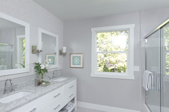
Bathrooms
Use essential gray on vanities, cabinets, and furniture for a soothing spa aesthetic. Coupled with mirrors and metallics, the gray takes on a hint of contemporary cool. For a more vintage bath, combine it with antique whites.
Kitchens
The neutrality of essential gray makes it an ideal kitchen cabinet color. It has enough depth to contrast lightly colored countertops but doesn’t fight warm wood floors. Stainless steel and chrome fixtures also harmonize nicely.
Living Rooms
Essential gray is a foolproof choice for living room walls when you want a subdued, calming backdrop. Accent with vibrant jewel tones or earthy natural hues. Essential gray also pairs elegantly with room-spanning wood accent walls.
Using essential gray exteriors
Aside from interiors, essential gray works beautifully on home exteriors too. It provides a contemporary neutral backdrop for bolder exterior color schemes. Essential gray siding coordinates with white trim as well as brick and stone accents.
For a beach house, combine essential gray siding with navy blue shutters. Use it with crimson doors and clay tile roofs for Spanish-style homes. Essential gray offers the perfect neutral base to build your exterior color palette.
Essential gray in commercial spaces
Essential gray is an excellent choice for commercial and professional spaces like offices, hotels, and retail stores. It provides a sophisticated and stylish neutral backdrop without feeling too cold and stark.
Offices benefit from essential gray walls or modular office dividers. The color feels subtle and unintimidating for lobbies and waiting rooms. Pair it with pops of color like artwork, furniture, or brand messaging.
Hotels can use essential gray in guest room walls and hallways to create a relaxing oasis. For modern edge, combine it with chrome light fixtures. Add warm wood furniture for traditional elegance. Use gray as a neutral base for colorful retail store interiors too.
Conclusion
Essential gray is one of the most useful neutrals for home and commercial spaces. Thanks to its barely-perceptible, adaptive undertones, it complements both cool and warm color schemes beautifully. Essential gray shifts from airy and subtle to grounded and cozy depending on its surroundings.
Use essential gray as a foundational backdrop in your spaces and build upon it with other colors and materials. Test it out in different lighting to see the cool or warm undertones emerge. With its elegant neutrality, essential gray sets the stage for endless color combinations and designs.
