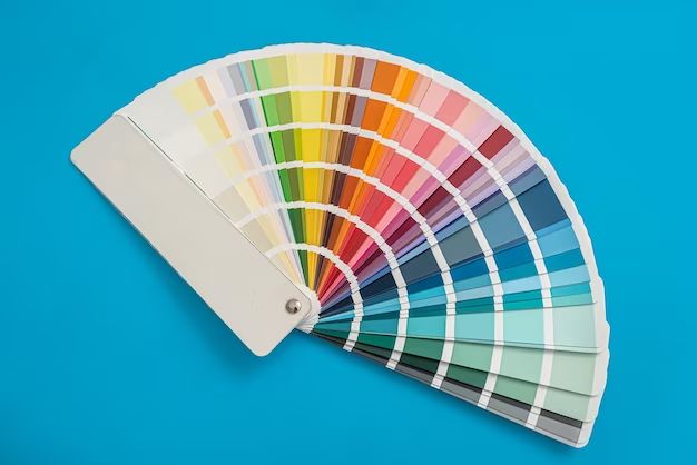
A complementary color scheme is a type of color scheme that combines colors opposite each other on the color wheel. This type of color scheme creates a high amount of visual contrast and vibrancy, making complementary colors really stand out when used together. Complementary colors are great for creating focal points and drawing attention in interior design. When you combine warm and cool shades, saturation, and textures, complementary color schemes can make for stylish, bold, and modern room designs.
What are complementary colors?
Complementary colors are any two colors opposite each other on the color wheel. For example, red and green, blue and orange, or yellow and purple. When complementary colors are placed next to each other, they create the strongest contrast of any color combination. This is because they share no common colors between them. Complementary colors highlight each other’s intensity, making both colors seem richer and more vibrant. The high contrast creates a dynamic energy that catches the eye.
Key principles for using complementary colors
Here are some key principles for working with complementary color schemes in interior design:
Use complements in small doses
Because complementary color combos are so bold, it’s best to use them sparingly in interior spaces. Use complements in accent pieces, artwork, pillows, rugs, and other smaller decor elements. Too much can become overwhelming to the eye.
Balance with neutrals
Balance vibrant complementary colors by pairing them with plenty of neutral colors like whites, grays, browns, tans, and black. The neutrals will give your eyes a place to rest and prevent the space from becoming too visually loud.
Vary shades and textures
Stick to just two complementary hues but play with tints, tones, and shades of each color. Combine different textures like glossy, matte, metallic, or distressed. This adds depth and sophistication.
Use one color as the dominant hue
Pick one color to be more dominant – about 60-70% of the scheme. Use the complementary color for accents. This creates a visually pleasing asymmetrical balance.
Example #1: Blue and orange living room
Blue and orange is a bold complementary pairing that works well in living rooms. Blue has a calming effect while orange provides energy and warmth. To keep the living room feeling relaxing, different hues and tones of blue dominate the space. Pops of orange come through in accessories and artwork. Here is an example blue and orange living room color scheme:
Blue tones
– Light blue walls (the dominant color at about 70%)
– Navy blue sofa
– Denim blue throw pillows
– Baby blue vase
Orange tones
– Burnt orange pillows on sofa
– Rust orange stripes on area rug
– Copper and orange abstract artwork over fireplace
– Amber glass table lamps
Neutral tones
– White trim and ceilings
– Gray stone fireplace
– Espresso wood coffee table
– Cream patterned armchair
The variety of shades and textures in the blue and orange tones keep them from competing. The balance of neutrals allows the complements to stand out without becoming overwhelming.
Example #2: Red and green kitchen
The vibrant complements red and green make a festive and energizing color scheme for kitchens. In this kitchen, different hues of green take center stage for a natural earthy vibe. Pops of cherry red provide visual excitement. Here is an example red and green kitchen color palette:
Green tones
– Sage green cabinets (the dominant color at about 60%)
– Lime green glass backsplash tile
– Green patterned laminate countertops
– Mint green kitchenaid mixer
– Olive green pendant lights
Red tones
– Cherry red bar stools
– Ceramic red utensil holder
– Apple red kettle on stove
– Red curtains over sink window
Neutral tones
– White subway wall tiles
– Gray quartz countertops
– Stainless steel appliances
– Espresso wood flooring
The matte sage green cabinets paired with the glossy vibrant backsplash tile create an eye-catching contrast. The bold red bar stools draw you into the space. Overall, the reds and greens feel balanced yet exciting.
Example #3: Purple and yellow bedroom
Purple and yellow is a surprising complementary pairing that brings dramatic contrast to a bedroom. In this room, soft purple sets a soothing mood while bright yellow accents provide cheerful pops of color. Here is how this complementary bedroom color scheme is executed:
Purple tones
– Lavender purple walls (the dominant color at about 65%)
– Plum purple bedding and shams
– Mauve and lilac patterned area rug
– Violet purple curtains
Yellow tones
– Sunflower yellow pillows
– Lemon and mustard yellow abstract wall art
– Golden yellow pendant light over bed
– Yellow orchids in glass vase on nightstand
Neutral tones
– White ceiling and trim
– Gray velvet headboard
– Espresso wood night stands and dresser
– Cream and charcoal patterned armchair
The soft purple walls contrast beautifully with the bright yellow floral pillows and artwork. The purple maintains a tranquil vibe while the yellow adds vibrancy. The creams and grays prevent the space from feeling oversaturated.
Tips for decorating with complementary color schemes
Some tips to keep in mind when decorating with complementary color schemes:
Check lighting
The colors will look different in warm incandescent vs. cool LED lighting. Check your colors in the space’s actual lighting conditions.
Add texture
Layers of texture add depth and sophistication. Incorporate glossy, matte, metallic, nubby, smooth, and distressed textures.
Repeat colors
Repeating complementary colors ties the whole room together. Reuse colors and patterns throughout the space.
Contrast sheens
Pair a glossy surface with a matte one to make colors pop. Contrasting sheens creates visual excitement.
| Complementary Color Scheme | Color 1 | Color 2 |
|---|---|---|
| Blue and Orange | Blue | Orange |
| Red and Green | Red | Green |
| Purple and Yellow | Purple | Yellow |
Conclusion
Complementary color schemes create high-impact, vibrant rooms with visual excitement. The contrast showcases each hue while neutrals provide balance. Vary tones and textures for depth. Use complements in small doses, with one color dominating. This allows the complements to play off each other without becoming overwhelming. With careful planning, complementary colors can make interiors feel contemporary, bold and stylish. The three examples show how blue and orange, red and green, and purple and yellow can liven up living rooms, kitchens and bedrooms with dramatic flair.
