Monochromatic color schemes are a popular choice for many designers and artists. A monochromatic color scheme uses different shades, tones, and tints within a single hue. This creates a cohesive and harmonious look. Monochromatic color schemes are easy to create and offer a clean and elegant aesthetic. In this article, we’ll explore what monochromatic color is, look at some examples, and discuss why it’s an effective design choice.
What is Monochromatic Color?
Monochromatic comes from the Greek words “mono” meaning one and “chroma” meaning color. As the name suggests, monochromatic color schemes use a single base hue and vary only in lightness and saturation. This creates a minimalist, refined look.
Some key characteristics of monochromatic color schemes:
| Uses a single base color |
| Variations in shade, tone, and tint of that color |
| Subtle and soothing |
| Elegant and sophisticated |
| Clean and coordinated |
The base color is dominant. Tints add white to lighten, shades add black to darken, and tones are subtle variations in saturation. This allows for a diverse spectrum within a single hue. You can create a wide range of effects while maintaining harmony.
Examples of Monochromatic Color
Monochromatic color schemes are widely used across visual mediums. Here are some examples across different contexts:
Art: Many famous paintings employ a monochromatic palette. Whistler’s famous painting Arrangement in Grey and Black No.1 uses almost exclusively shades of grey.
Interior Design: Using different tones of a single color provides continuity in home décor. Greige (grey + beige) is a popular monochromatic scheme for modern minimalist interiors.
Fashion: Monochromatic outfits in shades of blue, black or white project a sharp, elegant look on the runway. Accessories introduce contrasting pops of color.
Graphic Design: Logos like MasterCard, Wikipedia, and Vans use tints and tones of a single color for strong cohesive branding.
Photography: Black and white photography relies solely on different shades of grey to create dramatic effects.
Nature: Many animals use monochromatic camouflage like polar bears’ white fur or zebras’ striped black and white pattern.
So whether it’s fine art, fashion design, or the natural world, monochromatic color schemes are widely used and admired.
Benefits of Monochromatic Color
There are several reasons why monochromatic color schemes are an effective design choice:
Unity: Using a single hue creates a strong cohesive and harmonious look. This makes monochromatic schemes ideal for minimalist style.
Versatility: You can achieve a wide tonal range within a single hue. This allows for depth, contrast and visual interest.
Elegance: Monochromatic palettes project refined sophistication. Black and white schemes, in particular, have an air of timeless elegance.
Focus: With a dominant base color, monochromatic schemes place emphasis on form, shape and texture rather than color.
Accessibility: For color blindness accessibility, monochromatic schemes are ideal because they rely on contrasting lightness not distinct hues.
So whether you want to project cohesion, elegance or versatility, a monochromatic color scheme offers many advantages. It’s easy to see why designers return to this sophisticated palette again and again.
Tips for Creating Monochromatic Color Schemes
Here are some tips for effectively using monochromatic color in your own designs:
Choose a strong base hue: Go for a bold, rich color as your dominant shade. Popular choices are blue, green, purple, red, black, white and grey.
Mind value contrast: Use a wide range of tints, tones and shades for depth. Don’t vary saturation too extremely from your base color.
Add neutrals: Off-whites, blacks and greys complement monochromatic palettes as neutrals. They enhance the sophistication.
Use texture: Variations in materials and textures addneeded visual interest in monochromatic schemes.
Include pops: Sparing use of a contrasting color complements your scheme as an accent.
Trust color psychology: Pick a hue that aligns with your desired mood and aesthetics.
Following these tips will ensure your monochromatic color scheme is harmonious, versatile and impactful.
Monochromatic Color Scheme Examples
Let’s look at some examples of successful monochromatic color palettes:
Blue
| Light Blue | Medium Blue | Dark Blue |
Blue evokes calm, wisdom and productivity. This scheme uses a range of tones from light powder blue to deep navy. Perfect for corporate, professional and masculine aesthetics.
Green
| Light Green | Medium Green | Dark Green |
Green is associated with health, renewal and the natural world. A green monochromatic palette spanning mint, sage and forest green exudes an earthy, organic feel.
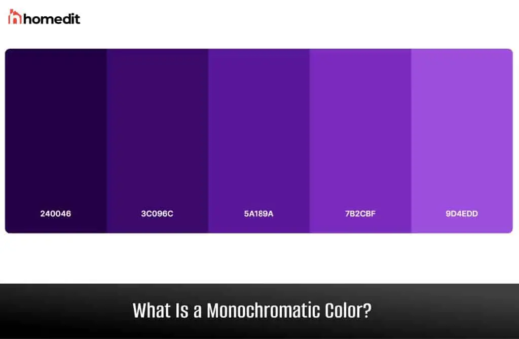
Purple
| Light Purple | Medium Purple | Dark Purple |
Purple has royal, mystical connotations. Pale lilacs paired with deep eggplants and plums create an elegant, feminine scheme.
Red
| Light Red | Medium Red | Dark Red |
Red is energetic, bold and passionate. A monochromatic red scheme spanning pink, crimson and burgundy packs a visual punch.
As you can see, monochromatic schemes allow for great diversity within a single hue. Choose colors aligned with your aesthetics for beautiful results.
Conclusion
In summary, monochromatic color schemes offer many advantages. Their refined, cohesive aesthetic allows designers to explore bold tonal contrast within a single hue. Whether you opt for sophisticated black and white or lush tones of green, a monochromatic palette is visually striking yet harmonious. This timeless scheme has continued to inspire artists and designers across eras and styles. So embrace the power of monochrome for your next project.
