Pastels are light, desaturated colors that evoke a soft, delicate feeling. They are some of the most versatile and popular colors to use in fashion, interior design, and art. But what exactly are the most popular pastel shades? Here we’ll take a look at 10 of the best pastel colors and what makes them so widely loved.
Pink
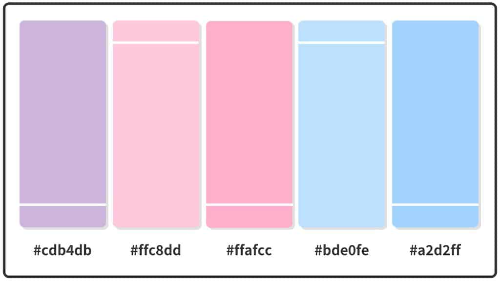
Pastel pink is one of the most quintessential pastel shades. It encompasses a range of light pinks, from blush to baby pink. Pastel pink has feminine connotations and creates a sweet, romantic look. It is a perfect color for spring and summer clothing, adding a soft touch to dresses, blouses, and accessories. Pastel pink also works beautifully in interiors, evoking cozy charm in bedrooms, living spaces, and more.
Mint Green
Mint green is another go-to pastel shade, ideal for spring and summer. This cool green tone is crisp and refreshing. It looks gorgeous in fashion when paired with other pastels like pink and peach. Mint green also stands out in home decor, adding a clean, rejuvenating color to walls, furniture, textiles, and accessories. It has a less feminine vibe than pink, making mint green more versatile across styles and spaces.
Lavender
The light purple tone of lavender is soft, calming and elegant. It has long been associated with relaxation and serenity. Lavender is a perfect accent color for bedrooms, spas, and meditation spaces. It also works beautifully in floral fashion prints and looks great combined with pink or yellow. Lavender has universal appeal across ages and genders when used in moderation.
Peach
Peachy pastel shades bridge pink and orange tones. They have the prettiness of pink and the cheerful brightness of orange. Pastel peach conveys sweetness and vibrancy. It looks amazing incorporated into spring/summer attire. Peach also stands out in kitchens, dining rooms, and kids’ spaces when used in decor. The lighter end of the peach spectrum pairs well with other soft pastels.
Yellow
Pastel yellow brings the brightness of full yellow down to a softer decibel. It retains the cheerful, upbeat feeling of yellow while feeling gentler. Pastel yellow is perfect for achieving a vintage vibe in fashion and decor. It also pairs beautifully with gray and blue. Use pastel yellow in moderation to keep spaces feeling airy and designs feeling fresh.
Blue
Light and airy pastel blues are reminiscent of blue skies and are strongly associated with spring and summer. Pastel blue feels cool, calm, and breezy. It is a top choice for seasonal wear in dreamy prints and dresses. Blue also adds a pleasant openness to interior spaces. Go for a soft powder blue or pale sky blue to evoke relaxation. Pair pastel blue with white for an ethereal look.
Lilac
As a light purple with hints of pink, lilac straddles the line between the two shades. It is daintier than lavender and perfect for achieving a dreamy, romantic aesthetic. Lilac evokes spring blooms and looks gorgeous in floral prints. It also pops beautifully against neutrals like white. Use lilac liberally in bedrooms, living spaces, and bathrooms for a soft ambience.
Seafoam Green
Seafoam green is a pale, cool pastel shade with hints of blue. True to its name, it resembles ocean surf. Seafoam green is ideal for beachy, nautical designs. It also serves as a soothing neutral shade that isn’t as stark as mint green. Use seafoam green in moderation with other soft colors. It works well in bathrooms, kitchens, and bedrooms.
Coral
Pastel coral adds a pop of peachiness to any space. It’s fun, energetic shade that pairs perfectly with mint green and teal. In fashion, coral is a must-have for summer and looks amazing on tan skin. In interiors, it brings warmth and vibrancy when used sparingly with cream or white shades. Coral makes a memorable accent color for artwork, textiles, walls, and accessories.
Gray
Believe it or not, grays count as pastel shades when they are lightened to soft, muted tones. Pastel gray serves as a versatile neutral option for modern spaces. Pair it with darker grays and blacks for a chic, sophisticated look. Or, combine it with bright whites and pastels for a cheerful contrast. Use pastel gray in backgrounds, furniture, and accessories to let other colors shine.
Best Uses for Pastel Colors
Here are some of the most popular and effective ways to utilize pastels:
- Women’s clothing – dresses, blouses, skirts, accessories
- Men’s clothing – shirts, shorts, sweaters, neckties
- Children’s clothing – everything from onesies to dresses
- Wedding attire – bridesmaid dresses, suits, decor
- Bedrooms – walls, bedding, artwork, furniture
- Bathrooms – tiles, shower curtains, towels, accessories
- Kitchens – accent walls, dishware, appliances
- Outdoor spaces – patio furniture, umbrellas, planters
- Artwork – paintings, photography, graphic design
Most Flattering Pastel Color Combinations
While pastels look beautiful on their own, combining them creates stunning springtime palettes. Here are some of the most flattering pastel color schemes:
| Color 1 | Color 2 |
|---|---|
| Pink | Mint Green |
| Lavender | Peach |
| Yellow | Blue |
| Lilac | Seafoam |
| Coral | Sage Green |
| Pastel Gray | White |
These color pairs create harmonious, elegant palettes perfect for the spring and summer seasons. They are well-balanced and easy on the eyes.
Conclusion
Pastels remain one of the most chic, versatile color choices for modern fashion and interior design. Whether used on their own or combined with each other, they create a soft, welcoming aesthetic. The most popular pastel shades include pink, mint green, lavender, peach, yellow, blue, lilac, seafoam green, coral and gray. These colors suit everything from women’s dresses to bedroom walls for their delicate, uplifting hues. With infinite possibilities, pastels are here to stay as eternal springtime favorites.
