Hot pink is a vibrant and energetic shade that evokes playfulness, youth, and femininity. With its warm, reddish base punctuated by a punch of blue undertones, hot pink is a complex color that invites some natural questions around its composition. Specifically – does hot pink contain blue?
To understand the origins of hot pink’s unique vibrancy requires a closer look at how color is created and perceived. While our eyes may tell us that hot pink contains hints of blue, the reality is more complex.
By exploring the history of hot pink, examining how computer screens create color, and analyzing hot pink’s place on the color wheel, we can get a more definitive answer to the question at hand. The interplay of visual perception, color theory, and technology all contribute to hot pink’s captivating, yet slightly tricks, appearance.
A Brief History of Hot Pink
While vibrant pinks have long existed in the natural world, the specific shade “hot pink” didn’t emerge until the 20th century.
In the 1930s, various fashion designers and trendsetters began experimenting with unconventional, bold pinks. Elsa Schiaparelli was one early pioneer, who used what she called “shocking pink” in her fashion collections beginning in 1937. This shade, which veered toward reddish magenta, sparked a trend toward brighter, bolder pinks.
In the 1950s, the rise of rock and roll, movie technicolor, and youth culture further popularized intense, hot pinks. The advent of chemical dyes and neon colors contributed to pink’s amplification during this era. Hot pink became connected with rebelliousness, fun, and frivolity.
The exact phrase “hot pink” came into use in the late 1950s and early 1960s. It was frequently seen in women’s fashion and automotive colors during this time. Within popular culture, hot pink became solidified as a bold, intense variant of conventional pink.
How Computer Screens Create the Color Pink
When looking at hot pink through a digital screen, we’re seeing it via an additive color model known as RGB. This stands for the three primary colors used in screen display: red, green, and blue.
By combining different intensities of red, green, and blue light, screens can reproduce a vast spectrum of hues. To create hot pink, the red is turned up high, with a medium intensity of blue. The levels look something like this:
Hot Pink RGB Values
- Red: 255
- Green: 105
- Blue: 180
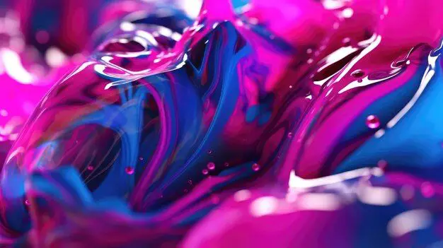
This mixing of a strong red and medium blue produces hot pink’s vibrant reddish/pink appearance underlined with blue undertones. Our eyes and brain see these combined wavelengths of light and interpret them as “hot pink”.
So technically, hot pink does contain blue as a component – about 180/255ths worth, according to the RGB color model. However, we can’t conclusively say hot pink “has” blue in an absolute sense, since this blue element only exists at the level of light wavelengths.
Hot Pink on the Color Wheel
The color wheel provides another perspective on how hot pink is composed. The color wheel arranges hues in a circle according to their visual relationships. Complementary colors – those opposite each other on the wheel – play an especially important role.
Hot pink’s complement on the color wheel is mint green. These two colors enhance each other through high contrast. Importantly, hot pink does not have blue as its complement. This further confirms that while hot pink contains some blue tones in its RGB values, conceptually it is more akin to a reddish pink than a true mix of blue and red.
How We Perceive Color
Assuming hot pink doesn’t actually contain blue, why does it appear to our eyes as having blue undertones? The answer has to do with the quirks of human visual perception.
In large part, we see color through contrast and comparison with surrounding colors. Hot pink appears to “pop” more against neutrals like white or black because of the high contrast.
Similarly, hot pink can take on a slightly different hue when placed next to purples, oranges, or yellows. The nearby colors impact how our eyes interpret the shades of pink.
Specifically, hot pink placed in proximity to yellow takes on a more distinct bluish tone. The yellow seems to draw out the subtle cool undertones in hot pink.
This is why hot pink may subjectively appear blueish depending on the context we see it in, even though technically it does not contain blue pigment. Our eyes are simply responding to the color contrasts and tricks of adjacent hues.
Applications of Hot Pink
Understanding hot pink’s relationship with blue gives us insight into effective applications of this vivid shade. Here are some tips for leveraging hot pink’s expressive power:
Text on Hot Pink:
- For high contrast, pair with dark-colored text like black, charcoal gray, or chocolate brown.
- For softer contrast, use white, cream, or pale gray.
- Avoid light blue text, as it will likely clash or get lost.
Coordinating with Hot Pink:
- Deep purples, reds, and magentas make harmonious pairings.
- Cool pastels like mint green, sky blue, and lilac nicely complement hot pink.
- Warm shades like orange, coral, and yellow draw out hot pink’s blue undertones.
- Limit use of true blues, which can overpower hot pink.
Alternate Name Ideas:
- Since hot pink skews more toward red and magenta undertones, descriptive names could reference Crimson, Magenta, Fuchsia, or Cerise.
- Avoid alternate names with “blue” since this overemphasizes the blue aspect.
So in summary, while hot pink contains some blue tones digitally, conceptually it lives in the pink/red color family. Careful coordination with adjacent colors allows hot pink’s subtle cool undertones to emerge, producing pleasing, vibrant results.
Conclusion
Does hot pink have blue? The answer spans color theory, visual perception, and technology. While screens display hot pink with a moderate blue RGB component, conceptually hot pink sits closer to the red end of the color wheel. However, adjacent colors can bring out hot pink’s hidden blue undertones through visual contrast effects.
Ultimately hot pink’s origins, technical composition, and perceptual quirks all contribute to its emotive, eye-popping impact. So whether hot pink truly contains blue depends on how one views the color relationship. And understanding this nuance allows for more effective, strategic use of this exuberant, boundary-defying hue.
References
Color Theory:
- J. Briggs, “The Dimensions of Color,” 1967.
- A. Sève, “Science of Color,” Elsevier, 1996.
History of Pink:
- M.K. Hargrave, “Pink: The History,” 2016.
- V. Steele, “The Berg Companion to Fashion,” Bloomsbury Academic, 2010.
Color Perception:
- R.W. Rodieck, “The First Steps in Seeing,” Sinauer Associates, 1998.
- S.K. Shevell, “The Science of Color,” Elsevier, 2003.
