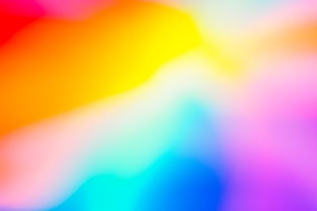
Colors can have a profound impact on our emotions and moods. Some colors are considered vibrant, meaning they are bold, bright, and energetic. Vibrant colors tend to evoke excitement, joy, and positivity. In this article, we will explore what makes a color vibrant, provide examples of popular vibrant colors, and discuss how to use vibrant colors effectively.
What Makes a Color Vibrant?
There are a few key characteristics that make a color vibrant:
– High saturation – Vibrant colors are fully saturated rather than muted. The pigment is pure and intense.
– High brightness/lightness – Vibrant colors tend to be lighter and brighter, rather than dark. They have high values on the color wheel.
– Warm temperature – Colors on the warm end of the color spectrum tend to be more energetic. Cooler colors may be bright but lack warmth.
– High contrast – A vibrant color will stand out against neutral backgrounds. The high contrast creates visual interest.
– Pure hue – Vibrant colors typically have a strong, pure hue rather than being mixed or shaded. Primary and secondary colors are often very vibrant.
Examples of Vibrant Colors
Here are some classic examples of vibrant colors:
– Red – A primary color, red is associated with love, energy, and excitement. It has maximum saturation on the color wheel.
– Yellow – Another primary color, yellow is cheerful and youthful. It reflects optimism and creativity.
– Orange – As a mix of red and yellow, orange carries the energy of both colors. It represents enthusiasm, fun, and adventure.
– Magenta – This secondary color is a bold mix of red and blue. It is playful, imaginative, and unconventional.
– Lime green – The vivid brightness of green mixed with a hint of yellow captures the freshness of citrus and nature.
– Turquoise – With a cool blue base mixed with green, turquoise radiates calm along with its bursts of color.
– Fuchsia – The vibrant reddish-purple evokes passion, confidence, and dynamism.
| Vibrant Color | RGB Values | What it Represents |
|---|---|---|
| Red | RGB(255, 0, 0) | Love, energy, excitement |
| Yellow | RGB(255, 255, 0) | Optimism, creativity, youthful spirit |
| Orange | RGB(255, 165, 0) | Enthusiasm, adventure, fun |
| Magenta | RGB(255, 0, 255) | Playfulness, imagination, unconventionality |
| Lime green | RGB(50, 205, 50) | Freshness, vibrancy, citrus flavor |
| Turquoise | RGB(64, 224, 208) | Calm, relaxation, cool tranquility |
| Fuchsia | RGB(255, 0, 255) | Confidence, passion, dynamic energy |
Using Vibrant Colors Effectively
When using vibrant colors, it’s important to employ them intentionally to create the desired look and feel. Here are some tips:
– Use vibrant colors in moderation – These bold tones are best when offset with plenty of neutral backgrounds. Don’t overdo it.
– Consider color psychology – Each vibrant shade elicits specific emotions. Use reds for high-energy areas, yellows to boost optimism, etc.
– Pair with analogous hues – Analogous colors next to each other on the color wheel create nice tension. Try magenta and red.
– Contrast with shades – Using a tint, tone, or shade of a vibrant color reduces intensity. This allows the original hue to pop.
– Add texture and prints – Layering patterns, prints, and textures with vibrant colors adds visual interest.
– Use accent colors – Vibrant hues can highlight and draw attention as accents against neutrals. A little goes a long way.
Conclusion
Vibrant colors bring energy and dynamism wherever they are used. They capture attention and create excitement. When applying vibrant colors, consider the psychology and meaning behind them. Effective use as accent colors, intentional pairings, and contrast with neutrals and shading can all prevent over-saturation. With some guidelines, vibrant colors can take any design, space, or composition to the next level. Their boldness stimulates our emotions and brightens our experiences.
