When discussing colors, it can be useful to identify the “opposite” of a certain shade. For the color red, determining the opposite color is not as straightforward as simply picking the color at the other end of the color wheel. There are a few different ways to think about what the opposite of red could be. This article will look at some of the possibilities for opposite colors of red and how color theory plays into this question.
Complementary Colors
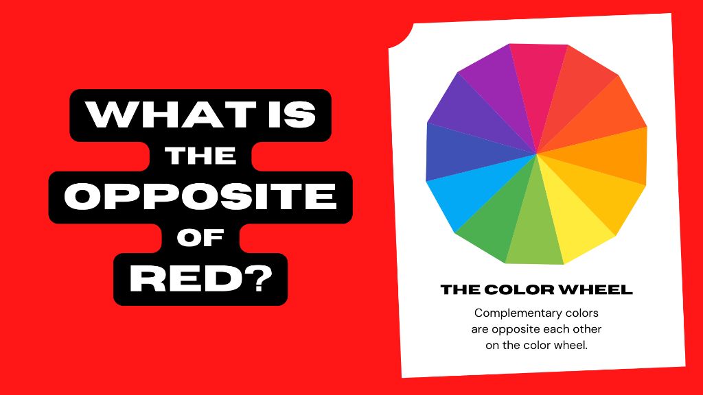
In color theory, opposite colors are known as complementary colors. These are color pairs that sit directly across from each other on the color wheel. For example, red and green are complementary colors, as are yellow and purple. When placed side-by-side, complementary colors create a strong visual contrast, as they contain no hues in common.
So based strictly on color theory, the opposite or complementary color of red is green. However, green may not be the only option for an opposite of red, depending on how “opposite” is defined.
Analogous Color Harmony
Another approach is to consider analogous colors. These are colors that sit next to each other on the color wheel. With red, this would mean looking at orange and violet:
| Red | Orange | Violet |
In an analogous color scheme, violet can provide a nice visual contrast to red while still maintaining some harmony. So violet could be considered an opposite of red in this context.
Mixing Color Pigments
When mixing pigments like paint, the opposite of red could simply be considered the color that results from mixing all the pigments together to get black or gray. For painting, the more pigments you mix together, the darker the color becomes. So theoretically, if you started with a red paint and mixed in more and more of the other color pigments, you would end up closer and closer to black, brown, or gray.
From this perspective, a dark muted color like brown, black, or gray can be thought of as the opposite of a bold saturated color like red.
Light vs. Pigment
It’s also worth noting that colors of light and colors of pigment work differently. With light, the primary colors are red, green, and blue (RGB). Mixing these colors of light together gives white. But with pigments, the primary colors are red, yellow, and blue. Combining pigments eventually results in black, or a very dark brown or gray.
So depending on whether we are talking about light or pigment, the “opposite” of red has different results:
| Medium | Primary Colors | Mixing Primaries | Opposite of Red |
| Light | Red, Green, Blue | Gives White | Cyan |
| Pigment | Red, Yellow, Blue | Gives Black | Black, Grey |
So when discussing light, the opposite of red is cyan. But for physical pigments, black, grey, or brown are opposites of red.
Psychology of Color
There are also psychological considerations when determining the opposite of red. Red is considered a warm, passionate, high-energy color. It attracts attention and conveys a sense of excitement. What color conveys the opposite meaning and emotions?
Cooler colors like blue and green are calmer and more serene. Neutral browns and greys also have a stabilizing effect. And black has a formal, elegant look. Based on psychology and the moods colors evoke, blue, green, brown, grey, or black could all be reasonable “opposites” of the attention-grabbing, high-energy color red.
Personal Preferences
Ultimately, the choice of an opposite color for red comes down to personal preference and how “opposite” is defined. Some possibilities include:
- Green – Complementary color directly across the color wheel from red
- Violet – Analogous cool color next to red on the wheel
- Cyan – Additive opposite on the RGB color model
- Black – Subtractive opposite when mixing pigments
- Blue – Psychologically calmer opposite to intense red
So while green and cyan are clear technical opposites of red, there are many possibilities depending on the context and how contrast is perceived. When choosing an opposite color in design, it helps to consider the overall color scheme, the emotions you want to evoke, and the meaning you want the colors to convey.
Examples of Using Red’s Opposite Color
Let’s look at some examples of using red’s opposite color to create contrast:
Traffic Lights
Red and green traffic lights use complementary colors opposite each other on the color wheel. This creates a clear visual distinction between stop and go.
Christmas Colors
Red and green are commonly paired as Christmas colors. They have an eye-catching complementary contrast.
Warning Signs
Black and red signs convey urgency and danger. Black has a bold opposite look to attention-grabbing red.
Fire and Water
Red fire and blue water are symbolic opposites. One is hot, the other cool.
Recommended Uses
Here are some recommended uses of red’s opposite color based on different goals:
| Goal | Recommended Opposite of Red |
| Maximal color contrast | Green |
| Create visual interest | Violet, Cyan |
| Neutralize energy | Blue, Grey |
| Convey danger | Black |
Conclusion
While green is the technical complementary opposite of red, there are many possibilities depending on context. Cyan, violet, blue, grey, black, and other colors can provide visual contrast and convey different moods. When choosing an opposite color, consider the overall scheme, the emotions evoked, and the meaning you want to communicate. With planning, red’s opposite color can create perfect visual harmony, interest, and balance.