The 1960s were a time of great cultural change and experimentation. Fashion and design trends reflected the revolutionary spirit of the era. Bold, vibrant colors came into vogue, shifting away from the more conservative neutrals and pastels of previous decades. In this article, we will explore the most popular colors for clothing, interiors, cars, and graphic design in the 1960s. Understanding these color trends provides insight into the culture and zeitgeist of this fascinating period in history.
Clothing Colors
Clothing and fashion underwent a radical transformation in the 1960s. The conservative, formal fashions of the 1950s gave way to more casual, youthful styles. Hemlines became shorter, silhouettes shifted from stiff tailoring to fluid, unstructured shapes. Colors and patterns became more vibrant and psychedelic. Several key color trends emerged in 1960s fashion:
– Neon colors – Electric, supersaturated versions of colors like pink, orange, green and yellow exploded in the 1960s. Pop art and psychedelic aesthetics influenced fashion to use these bright, eye-catching neon shades.
– Primary colors – Simple, bold reds, blues and yellows were ubiquitous in 1960s clothing. Primary colors reflected the simplified, graphic aesthetics of mod fashion.
– Pastels – Softer, subtler pastel shades like lemon, lavender, mint and sky blue were also popular in the first half of the 1960s. Pastels had a retro, romantic feeling that aligned with 60s youth culture.
– Metallic colors – Shimmering metallic shades like gold, silver, copper and bronze added a space-age, futuristic flair to 60s fashions. Metallic mini skirts, pants and dresses were a glamorous style statement.
– Black and white – Classic black and white remained a staple pairing in 60s fashion. Black and white expressed the mod monochrome aesthetic that permeated the decade.
Interior Design Colors
Home décor saw many changes in color trends during the 1960s. Traditional 1950s interior design motifs gave way to more dramatic, vibrant looks. Some of the most notable interior color directions included:
– Harvest gold – A warm, earthy shade of golden orange, almost mustard-like in tone. Harvest gold was extremely popular in 60s appliances, carpeting and upholstery.
– Avocado green – Deep green with yellow undertones was a fixture in 60s kitchens and bathrooms. Avocado green had a retro, art deco feel.
– Burnt orange – Deep, intense orange with a brownish hue was used extensively in living spaces and bedrooms during the late 60s. It gave interiors a cosy, welcoming feel.
– Bright blues – Vibrant shades like cobalt, royal, sky and turquoise blue appeared in furniture, tiling, walls and accessories throughout the 60s. Blues conveyed a playful energy.
– Psychedelic prints – Trippy floral, geometric and abstract prints in neon colors were popular in the late 60s and early 70s. These prints aligned with 1960s psychedelia.
Automotive Colors
Car manufacturers embraced bold, expressive colors in the 1960s. Pastel vehicles gave way to bright colors and metallics that captured the rebellious energy of the era. Some key automotive color trends included:
– Candy apple red – Vivid, deep red with a layered translucent effect. Used on sporty cars and muscle cars. Connoted power and speed.
– Sunfire yellow – Bright, metallic yellow that conveyed vibrancy and fun. Popular on vehicles like the Ford Mustang.
– Midnight blue – Rich shades of blue, often with metallic flecks. Created a sophisticated, sleek look. Used on many American luxury vehicles.
– British racing green – Deep green inherited from Jaguar and other British sports cars of the 1950s. Had sporty, elite associations.
– Turquoise – Bluish-green shades were prevalent on American cars. Gave vehicles a playful, casual feel. Popular in the early 1960s.
Graphic Design Colors
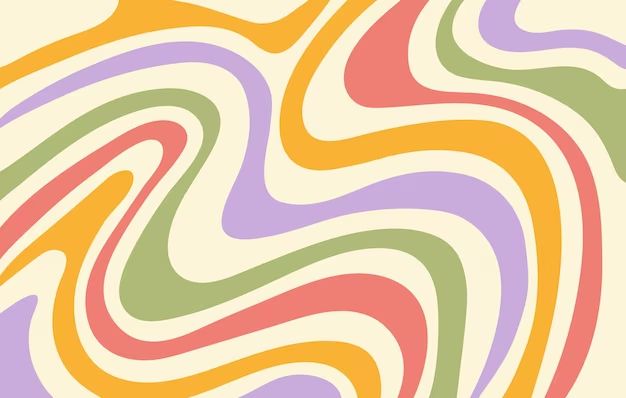
Vibrant color palettes came to dominate graphic design and advertising in the psychedelic late 1960s. Some colors widely used in posters, album covers, advertisements and other graphic media included:
– Fuchsia/magenta – Vibrant reddish-purple associated with psychedelic and pop art aesthetic.
– Lime green – Bright, intense green that created an electric, eye-catching impact.
– Hot pink – supersaturated pink, leaning towards magenta. Connoted youth, fun and femininity.
– Acid yellow – Neon yellow with greenish tint. Used to create a psychedelic look and feel.
– Ultraviolet – Bright purplish tones that seemed to glow. Evoked psychedelic imagery of blacklights.
Key Factors Influencing 1960s Colors
What cultural and societal forces drove the shift towards vibrant color palettes in the 1960s? Here are some of the key influencing factors:
– Youth culture – Young people were a driving force in society and culture in the 1960s. Their energy and tastes ignited new color trends.
– Psychedelic drugs – Mind-altering substances like LSD had a huge impact on visual culture. Trippy colors mimicked psychedelic experiences.
– Pop art movement – Vibrant pop art by artists like Andy Warhol brought bright colors into fine art and design.
– Space age – Fascination with space, science fiction and the future inspired metallic and neon colors.
– Counterculture – Rebellious groups like mods, hippies and others used color to express their unconventional worldviews.
– Consumer culture – Increased production and consumerism made bold colors and finishes more accessible and affordable.
– Changing values – The social revolutions of the 1960s opened society up to greater self-expression and experimentation with color.
Regional Color Differences
While vibrant colors were popular nationwide, specific regional color preferences also emerged:
West Coast
– More psychedelic, trippy colors – fuchsia, acid green, hot pink
– Surf culture colors like turquoise and lemon yellow
– Openness to outrageous, experimental hues
Midwest/Heartland
– More muted earth tones like burnt orange and avocado
– Less outrageous but still shifted away from traditional colors
– Reflected roots in nature and agriculture
East Coast
– More affinity for black, white and primary colors
– Graphic mod styles in red, blue and yellow
– Primary colors reflected bold directness of the urban Northeast
Southern California
– Embraced sunset colors – warm yellows, oranges, pinks
– Surf culture bright turquoise and aquamarine
– Free-spirited counterculture sensibility
Popular Color Combinations
Some popular color pairings and combinations included:
– Black and white – Classic high contrast duo remained popular
– Primary colors – Simple trios like red-blue-yellow or blue-yellow-red
– Complementary colors – Vibrant complementary pairs like orange + blue
– Tonal combinations – Different shades of the same color, often pastels
– Bright + muted – Contrasting bright colors with earth tones
– Warm + cool – Temperature contrasts like red + green or orange + blue
– Neon rainbow – Combining multiple neon shades for psychedelic effect
Conclusion
The 1960s represented a revolutionary time of social and cultural upheaval. Color trends were an important reflection of this spirit of change and experimentation. While 1950s styles were relatively muted and restrained, designers and consumers embraced color in new ways in the 1960s. Vibrant primaries, neonRainbow hues, metallic sheens and psychedelic palettes came to represent this remarkable decade. Even as fashions changed over this dynamic period, color was always at the forefront of expressing the energy and mood of the generation. The bold colors of the 1960s echoed the colorful personalities that powered cultural change and made the decade so unique.
