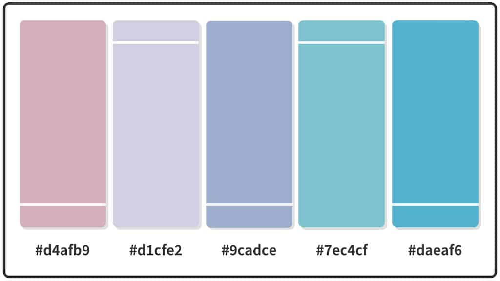
Pastel colors refer to soft, pale shades of color that are often created by mixing a significant amount of white into the original hue. Pastels are known for being gentle, calming, and airy. When used together in color schemes and palettes, pastel colors can create gorgeous combinations that feel light, bright, and uplifting. Finding matching pastel shades that coordinate well requires some color theory knowledge. With the right guidelines, you can learn how to expertly combine pastel color palettes for beautiful, harmonious results.
Understanding Color Harmony with Pastels
Making pastel colors work together relies heavily on understanding color harmony. Color harmony refers to color combinations that are pleasing to the eye. It depends on controlling the use of colors within a certain color scheme. Some main types of harmony with pastels include:
Analogous harmony – Using 3 or more pastel colors that are adjacent to each other on the color wheel. For example, peach, yellow, green.
Complementary harmony – Pairing pastel colors from opposite sides of the color wheel. For example, pink and green.
Triadic harmony – Using 3 pastel colors that are spaced evenly around the color wheel. For example, yellow, purple, and green.
Tetradic/rectangular harmony – Combining 4 pastel colors from opposite sides of the color wheel. For example, orange, purple, green, blue.
These types of color harmonies provide a foolproof way to select pastel shades that naturally look cohesive together.
Best Pastel Color Combinations
Now let’s explore some of the most popular and pretty pastel color palettes that use principles of color harmony to create aesthetic appeal:
Mint, Lavender, and Peach
A soft palette with analogous harmony. Mint green, lavender purple, and peach all sit beside each other on the color wheel, making them complement each other beautifully. Mint and lavender also make a great complementary pair. This combination is perfect for spring and summer.
Pink, Yellow, and Blue
These three pastel hues form a triadic harmony, as they are evenly spaced around the color wheel. Pink, yellow, and blue is a classic pastel palette that is bright and cheery. It is versatile enough to work for any pastel project.
Strawberry, Lime, Blueberry, and Orange
Vibrant pastel versions of these colors form a lively, vivid tetradic harmony. Strawberry red, lime green, blueberry, and orange offer high contrast for a bold statement. Together they are retro, funky, and eye-catching.
Lilac, Sage Green, Sky Blue
Soft and dreamy, these three analogous colors are perfect for a baby shower or spring wedding. They are gentle, romantic pastels that evoke thoughts of flowers and nature. Lilac, sage green, and sky blue work seamlessly together.
Coral, Teal, Chartreuse
This bold, summery palette pops by mixing warm and cool analogous colors. Hot coral, bright teal, and zesty chartreuse make for an energizing combination. They remind you of the feeling of tropical beaches.
| Pastel Color Palette | Color Harmony | Mood |
|---|---|---|
| Mint, Lavender, Peach | Analogous | Calming, refreshing |
| Pink, Yellow, Blue | Triadic | Bright, cheerful |
| Strawberry, Lime, Blueberry, Orange | Tetradic | Retro, bold |
| Lilac, Sage Green, Sky Blue | Analogous | Soft, romantic |
| Coral, Teal, Chartreuse | Analogous | Energizing, tropical |
Tips for Combining Pastel Colors
When assembling pastel color schemes, keep these tips in mind:
– Stick to a maximum of 4 colors in one palette. Too many pastels together can look messy.
– Balance warm and cool tones. For example, pair a warm pastel like peach with a cool one like mint blue.
– Vary color saturation. Use both lighter and brighter pastels together.
– Add neutrals. Soft whites, grays and tans help ground bright pastels.
– Repeat your main pastel across the scheme. For example, use peach as an accent.
– Transition colors smoothly. Blend pastels together for a unified look.
Using Pastels in Home Decor
Pastel color schemes are hugely popular for decorating homes with a soft, peaceful aesthetic. Here are some ideas:
Pastel Walls
Paint interior walls in matching or contrasting pastels. Keep it subtle with a monochromatic scheme or make a bold statement with contrasting brights.
Pastel Furniture
Upcycle wood furniture with chalk paint in cute pastel hues. Or introduce pastels through upholstery like pillows, blankets, and chairs.
Pastel Accessories
Use pastel artwork, candles, throws, flowers and tableware as pretty home accents. Pastel accessories pop against white walls.
Pastel Kitchen
Kitchens are a great place to add splashes of pastel. Try a mint backsplash, blush pink cabinets, or lemon and blue cookware.
Choosing Pastel Clothing and Fashion
Delicate pastel colors are also hugely popular for clothing and fashion. Here are some tips for wearing pastels:
Mix and Match
Don’t be matchy-matchy. Pick one pastel color as your dominant hue and mix in other shades. For example, pair a lilac shirt with pink shoes.
Neutral Pairings
Anchor your outfit with neutral pieces like white, tan, denim, or black. Pastels pop when adjacent to neutrals.
Metallic and White Accents
Add some shine with metallic shoes, jewelry, or bags. Crisp white also complements soft pastels nicely.
Muted Tones
Prefer a more subtle look? Stick to muted, dusty pastel tones like mauve, sage, and buttercream.
All Over Pastels
Feeling bold? Wear pastels from head to toe for an energetic, fanciful look. This works best in spring and summer.
Conclusion
With their soft, dreamy appeal, pastel color palettes never go out of style. Using the principles of color harmony is key to combining pastels in aesthetically pleasing ways. Analogous, complementary, triadic, and tetradic pastel palettes all create beautiful, uplifting combinations. Incorporate a touch of pastel into your home decor, outfits, or DIY projects to add a whimsical pop of color. Feel free to experiment with both muted and vivid pastel shades to find a look that suits your personal taste and style.
