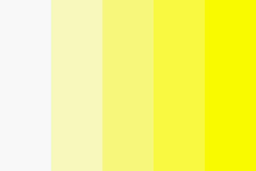
The yellow white shade, also sometimes referred to as cream, ivory, or off-white, is a light neutral color that has elements of both yellow and white. It sits between pure white and light yellow on the color wheel and is commonly used in interior design, fashion, and graphic design. There are a few different names used to refer to the yellow white shade depending on the specific hue, value, and chroma.
Common Names for Yellow White Shades
Some of the most common names used to describe the yellow white color spectrum include:
| Ivory | A pale creamy off-white |
| Cream | A richer, warmer off-white |
| Buttercream | A pale pastel yellow |
| Champagne | A metallic, shimmery pale gold |
| Oyster | A soft grayish off-white |
| Buff | A light tan yellow beige |
| Blonde | A pale muted yellow |
| Banana | A bright, clear pale yellow |
| Corn | A yellow-biased cream |
| Wheat | A muted tan yellow |
The specific names distinguish between different balances of yellow and white in the color. Ivory, for example, only has a small hint of yellow, while buttercream is more strongly yellow.
Defining Shade Names
There are a few key qualities that define the different yellow white shade names:
Hue – The actual color, ranging from warmer yellow tints to cooler white tints. Ivory is very white, while banana is very yellow.
Value – How light or dark the color is. Lighter yellow whites are often called cream. Darker ones may be oyster or buff.
Chroma/Saturation – How muted or vivid the color is. A vivid yellow white is buttercream, while wheat is more muted.
Temperature – How warm or cool the undertones are. Warm shades include cream, while cool ones are more ivory.
Context – Names sometimes relate to the object the color resembles. Champagne implies a metallic sheen, while corn references a yellow grain.
So an ivory shade would be a very light, desaturated, cool yellow white. Buttercream is light, but more saturated and warm. There are infinite subtle variations between the main yellow white names.
Common Uses for Yellow White Shades
Yellow whites are extremely versatile colors that work in many design contexts. Here are some of the most popular uses for yellow white shades:
Interior Design
– Walls – Light yellow whites brighten up rooms with sunny undertones. Ivory is a popular wall color.
– Furnishings – Upholstery and furniture in creams, buffs, and ivories provide a soft, welcoming look.
– Accents – Paler yellows like buttercream and banana bring in touches of color.
Fashion/Beauty
– Clothing – Cream, wheat, and champagne are commonly used in formalwear like bridal gowns.
– Accessories – Warm metallics like metallic champagne add glamor to accessories.
– Cosmetics – Ivory skin and nude lip/eye shades flatter many skin tones.
Graphic Design
– Backgrounds – Softer yellow whites make elegant backgrounds and can reduce eye strain.
– Icons – Bright banana yellow grabs attention against white backgrounds.
– Typography – Easy-to-read black text against pale yellow backgrounds.
Achieving the Perfect Yellow White Shade
There are a few different ways to produce that ideal yellow white color:
Mixing paint colors – Blend a bright white with small amounts of yellows like cadmium, yellow ochre, or naples yellow. Increase yellow for warmer, more saturated shades.
Digital design – Use RGB or CMYK codes to input specific shades. Add more yellow than magenta/red for golden undertones. Reduce all colors equally to mute a shade.
Dying/tinting – For textiles, dye whites with yellow dyes or tints. The concentration and dye composition impact the hue.
Lighting – The right lighting can make an existing white take on a yellow cast. Incandescent bulbs add warmth, while daylight keeps things neutral.
Always view test swatches under natural light to ensure the shade looks as intended. Compare to white to better judge the intensity of the yellow element.
Psychology of Yellow White Colors
Despite their neutrality, yellow whites can evoke psychological reactions:
Positive
– Warmth – Yellow undertones feel cozy, cheerful, and welcoming.
– Clarity – Clean, light yellow whites promote focus and alertness.
– Tranquility – Softer shades are soothing and can reduce eye fatigue.
Negative
– Imperfection – Too much yellow can look dingy, dull, or dirty.
– Delicate – Overly light shades show every smudge and scuff.
– Cold – Greenish yellow whites feel clinical and stark.
Culture
– Purity – Bridal gowns and baby clothes traditionally use snowy whites.
– Wealth – Historically, pure white fabrics were expensive to produce.
– Warmth – Yellow evokes sunny optimism in many cultures.
Overall, the positive associations with yellow white shades outweigh the negative. When used well, they have broad appeal across cultures.
Conclusion
While commonly referred to as cream, ivory, or off-white, the yellow white color spectrum has many subtle variations. The balance of yellow against white defines shade names like buttermilk, champagne, and wheat. Interior design, fashion, and graphic design frequently make use of these versatile, attractive colors. With some careful blending and lighting choices, designers can achieve beautiful results. When thoughtfully applied, yellow-tinted whites create welcoming, energizing spaces and products.


