Lavender is a light purple color that is often associated with relaxation, calmness, and sleep. It has a soft, soothing effect and is widely used in aromatherapy, candles, soaps, and other self-care products. But what is the opposite of lavender – a color that evokes energy, excitement, and vibrancy? There are a few potential candidates for the opposite of lavender.
Complementary Colors
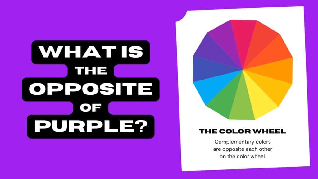
In color theory, colors that are opposite each other on the color wheel are considered complementary colors. These color pairs contrast strongly with each other, creating a vibrant look when used together. The complement of lavender on the color wheel is a lively, citrusy yellow. So a vibrant yellow could be considered the opposite of the calming, light purple lavender. Yellow evokes sunshine, happiness, and energy as opposed to the relaxation of lavender.
| Color | Feelings Evoked |
|---|---|
| Lavender | Calm, relaxed, sleepy |
| Vibrant yellow | Energetic, happy, bright |
When placed next to each other, lavender and vibrant yellow contrast strongly, creating an eye-catching, lively color combination.
Warm vs Cool Colors
Another way to find the opposite of lavender is to look at it in terms of warm and cool colors. Lavender is considered a cool color, associated with tranquility and passivity. The opposite would be a bold, fiery warm color that is energetic and exciting. Colors like red, orange, and yellow are all warm hues that contrast sharply with the cool calm of lavender.
Of these options, red and orange feel particularly opposite to lavender. Red evokes passion, excitement, danger, and action – completely different from the relaxed coolness of lavender. Bright orange also feels lively, energetic, and vibrant compared to the pale purple.
| Color | Temperature | Feelings Evoked |
|---|---|---|
| Lavender | Cool | Calm, relaxed, sleepy |
| Red | Warm | Energetic, passionate, exciting |
| Orange | Warm | Vibrant, lively, energetic |
So in terms of color temperature, the warm hues of red and orange can be considered opposites to the cool lavender purple.
Light vs Dark Colors
We can also look at the lightness and darkness of colors. Lavender is a very light, pale shade of purple. The opposite would be a very dark, deep color. Good candidates for lavender’s opposite based on darkness include black, navy blue, forest green, burgundy, or deep purple. These darker shades feel bold, dramatic, and powerful compared to the soft daintiness of light lavender.
| Color | Shade | Feelings Evoked |
|---|---|---|
| Lavender | Very light | Calm, delicate, relaxed |
| Black | Very dark | Dramatic, bold, powerful |
| Navy blue | Very dark | Confident, professional, steady |
So in terms of lightness, dark bold colors like black, navy blue, and deep purple can be seen as the opposite of the pale, delicate lavender.
Psychological Effects
We can also consider the psychological effects of different colors when determining lavender’s opposite. Lavender promotes relaxation, reduces stress, and encourages sleep. The opposite color would stimulate energy, productivity, and focus. Colors like red, orange, and yellow are known to boost mood, energize, and stimulate mental alertness. Blue is associated with productivity and focus. Green can also promote concentration and revitalization.
So in terms of psychological impact, warm colors like red, orange, and yellow appear to be the most opposite to lavender’s calming effects. Blues and greens could also be considered opposites as they boost productivity and focus instead of relaxation.
| Color | Psychological Effect |
|---|---|
| Lavender | Relaxation, reduced stress, sleep |
| Red | Energy, excitement, stimulation |
| Orange | Energy, happiness, creativity |
| Yellow | Energy, optimism, mental alertness |
| Blue | Productivity, focus, stability |
| Green | Concentration, revitalization, balance |
Color Meanings and Symbolism
Finally, we can look at the symbolic meanings associated with colors. Lavender symbolizes femininity, grace, elegance, and youth. The opposite would be colors associated with qualities like masculinity, strength, or aggressiveness. Reds, blacks, and dark shades are often associated with power, boldness, and masculinity. Warm metallic colors like gold and bronze are also seen as strong and confident.
| Color | Common Symbolism |
|---|---|
| Lavender | Femininity, grace, elegance, youth |
| Red | Love, power, strength, aggression |
| Black | Power, sophistication, elegance |
| Gold | Prestige, luxury, success |
| Bronze | Strength, dependability, stability |
Based on symbolic color meanings, the warm, strong colors like red, black, gold, and bronze contrast sharply with the feminine, graceful associations of light lavender.
Conlusion
When searching for the opposite of the color lavender, the complementary color yellow, warm colors like red and orange, darker shades like navy and black, and strong masculine colors like red and bronze all emerge as contenders. All of these colors evoke qualities completely different from lavender’s cool tranquility. Vibrant yellow, fiery red, mood-boosting orange, sophisticated black, and confident gold all provide a bold contrast to lavender’s delicate softness.
So in summary, the opposites of lavender include:
– Complementary yellow for contrast
– Warm shades like red and orange
– Dark colors like black, navy, and deep purple
– Masculine or strong colors like red, gold, and bronze
– Energizing colors like yellow and orange
– Productivity-boosting colors like blue and green
Any of these lively, bold options could be considered the opposite of the calming, feminine, light lavender purple. The exact opposite depends on whether we prioritize color temperature, lightness, symbolism, or psychological impact. But in general, vibrant warm colors and dark bold shades create the most contrast to lavender’s relaxation and softness.
