Understanding the differences between shade and tint is important for artists, designers, and anyone who works with color. While seemingly similar, shade and tint are actually opposite concepts on the color wheel. Knowing how to modify a color by adding black to create a shade or adding white to make a tint allows for nuanced variations in hue and value. In this article, we will explore what shade and tint mean, how they are created, and how they differ in their visual effects. Gaining command of these essential color concepts will give you greater flexibility and control when working with color in any medium.
Defining Key Terms
Before diving into the differences between shades and tints, it’s helpful to define some key color terms:
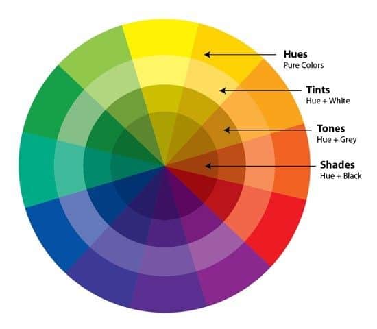
Hue – The attribute of color perception denoted by blue, green, yellow, red, purple, and orange. Hue refers to the base color itself rather than how light or dark it is.
Value – The lightness or darkness of a color, ranging from black to white. Adding white to a color increases value, while adding black decreases value.
Shade – A color with black added to it, making it darker. Shades have lower value and higher saturation.
Tint – A color with white added to it, making it lighter. Tints have higher value and lower saturation.
Saturation – The intensity or purity of a color, referring to how much gray it contains. Highly saturated colors are vivid, while less saturated colors are muted.
With these definitions in mind, let’s look at how shades and tints are created on the color wheel.
Creating Shades on the Color Wheel
On the color wheel, shades are colors created by adding black to a pure hue. This reduces the value of the color, making it darker. For example:
- Adding black to red produces a darker red shade.
- Adding black to blue makes a deeper blue shade.
- Mixing black with yellow generates an olive green shade.
When creating a shade, the hue remains recognizable even as the value decreases. Since black is neutral on the color wheel, adding it to a color retains the original hue. The saturation of a shade is heightened due to the contrast with the darkened value. Shades allow you to subtly augment a color for increased drama or emphasis.
Shades in Design
Shades are commonly used in design for:
- Adding depth and dimension through value contrast
- Increasing visual weight of an element
- Establishing hierarchy through darker, bolder colors
Using progressively darker shades of a color is an easy way to add gradient effects. And combining shades of complementary colors (those opposite each other on the wheel) produces bold, high contrast designs.
Creating Tints on the Color Wheel
On the color wheel, tints are made by adding white to a pure hue. This increases the value of the color, making it lighter. For example:
- Mixing white with red makes a pink tint.
- Adding white to blue produces a pale blue tint.
- Combining white and yellow generates a light yellow tint.
Just like with shades, the hue stays recognizable when making a tint. Since white is neutral, it lightens the color without skewing the original hue. However, the saturation of a tint is lowered as grayness is added with white. Tints allow you to softly temper a color for a gentle effect.
Tints in Design
Tints are commonly used in design for:
- Lightening and cooling down intensities of pure hues
- Indicating spatial recession through lighter values
- Softening outlines and borders when screened back
Subtle tints work nicely for background colors. And gradating tints of one hue produces a hazy, ethereal effect. Tints also pair well with shades of the same color.
Comparing Shades and Tints
Let’s summarize the key differences between shades and tints:
| Shades | Tints |
|---|---|
| Darker than original hue | Lighter than original hue |
| Lower value | Higher value |
| Higher saturation | Lower saturation |
| Add black to the pure color | Add white to the pure color |
As you can see, shades and tints take a color in opposite directions – darker with shades, lighter with tints. But both retain the original hue for variated effects.
Harmonious Shade and Tint Combinations
Shades and tints work beautifully together to create harmonious color combinations. Here are some examples of stunning shade and tint pairings:
Shades of Blue with Tints of Orange
The interplay of deep shades of cobalt or ultramarine blue with light tints of orange produces both appealing contrast and complementation, as blue and orange are opposite each other on the color wheel. The darker shades also recede while tints come forward.
Shades of Green with Tints of Red
Forest green shades complement the brightness of rose pink tints. These analogous colors are next to each other on the wheel for harmonious intermingling. The shades bring weight while tints add levity.
Shades of Purple with Tints of Yellow
Deep lavender shades set off lively tints of lemon yellow. These contrasting hues enliven each other. The moody shades provide foundation for the cheery tints to shine.
Combining shades and tints of one hue can also generate subtle monochromatic harmony. Overall, this contrast between the light and dark amplifies the elegance of each.
Achieving Visual Balance
Balancing shades and tints is an important aspect of design composition and color harmony. Here are some tips for skillfully integrating these color variations:
– Use a dominant shade or tint with smaller accents of the other. The interplay will be more dynamic with one taking precedence.
– Surround warm shades with cool tints, and vice versa, to heighten the temperature contrast. This creates visual interest.
– Alternate shades and tints in even or gradient patterns. The progression will be more seamless.
– Combine shades and tints of analogous hues for cohesive and harmonious palettes.
– Use tints in the foreground with shades receding into the background to mimic nature’s atmospheric perspective.
– Add tints to very dark shades to soften intensity and increase sophistication.
Thoughtfully composing shades and tints creates captivating color combinations. Use these techniques to add visual interest and depth to your designs.
Conclusion
Shades and tints are invaluable concepts for color theory and application. By adding black to make shades and white to produce tints, you can achieve refined variations of any hue. Mastering the skillful use of these color mixing techniques will elevate your artistic capabilities. Whether you are painting, designing graphics, or decorating interiors, understanding shades and tints gives you greater command over color for impactful palettes. So explore the nuances between these dark and light colorizations to become a true color expert.
