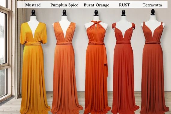
Burnt orange and terracotta are two similar shades of orange that are often confused with one another. Though they share some similarities, there are distinct differences between these earthy hues in terms of their undertones, uses, color combinations, and more. Understanding the nuances between burnt orange and terracotta can help you better utilize these colors in your home decor, fashion choices, graphic design work, and other applications.
Defining Burnt Orange and Terracotta
Before diving into the differences between burnt orange and terracotta, it’s helpful to define each shade:
- Burnt orange: A reddish-orange color that resembles the orange skin of a ripe orange. It has a slightly brownish tint from yellow and red undertones.
- Terracotta: An earthy orange tone reminiscent of natural clay. It’s a warmer, redder orange with strong brown undertones.
So in summary, burnt orange leans slightly more towards the orange side of the color spectrum, while terracotta sits further into the red-brown color family. But there is definitely overlap between these shades.
The Undertones
One of the key differences between burnt orange and terracotta comes down to undertones. Here’s a closer look at each hue:
Burnt Orange Undertones
- Slightly more yellow than terracotta
- Has both yellow and red undertones
- The yellow tones give it a brighter, more vibrant look
- Still contains some brown tones from the red undertones
Terracotta Undertones
- Strong red-brown undertones
- More earthy and muted than burnt orange
- Has a grayish tone from the brown undertones
- Minimal yellow undertones compared to burnt orange
So in summary, burnt orange is a warmer, more vibrant orange with yellow and red undertones. Terracotta is a dirtier, duller orange tone with predominantly brownish-red undertones.
Uses
The slightly different characteristics of burnt orange and terracotta lend themselves to some differing uses. Here are some typical applications for each shade:
Burnt Orange Uses
- Accent walls
- Upholstery
- Autumnal decor
- Halloween decorations
- Graphic design
- Sport team colors (University of Texas)
Terracotta Uses
- Pottery
- Tiles
- Craft paints
- Lipstick
- Eyeliner
- Blush
- Earthenware
- Southwestern decor
In general, burnt orange works better for brighter, bolder applications like in graphic design, clothing, and home decor. Meanwhile, terracotta’s earthier undertones suit natural materials like clay, cosmetics, and desert-inspired color palettes.
Color Combinations
When coordinating burnt orange or terracotta with other colors, some guidelines apply:
Burnt Orange Color Combos
- White: Creates a bright, retro look
- Black: Striking contrast
- Brown: Warm, earthy feel
- Yellow: Vibrant, energetic vibe
- Blue: Complementary colors
Terracotta Color Combos
- Sage green: Earthy, natural pairing
- Cream: Softer look than stark white
- Beige: Muted, calm combo
- Navy: Deep, moody vibe
- Gold: Warm and luxurious
Burnt orange looks best with lighter, brighter companion colors that play up its vibrancy. Terracotta works better with softer, more muted shades like creams and beiges.
Comparison Chart
Here is a quick visual summary comparing burnt orange and terracotta:
| Color | Hue Family | Undertones | Brightness | Key Uses |
|---|---|---|---|---|
| Burnt Orange | Orange | Yellow, red | Brighter | Decor, graphic design |
| Terracotta | Red-orange | Brown, red | Duller | Crafts, cosmetics |
Which Color is Which?
Looking at paint swatches and samples is the best way to see burnt orange and terracotta colors side-by-side. But as a quick reference, here are some real-world examples of objects in each tone:
Burnt Orange Things
- Orange peel
- Leaves in autumn
- Carrots
- Basketballs
- Traffic cones
Terracotta Things
- Clay pots
- Roof tiles
- Bricks
- Desert canyons
- Paprika powder
So burnt orange has more in common with vibrant fruit and vegetable colors. Terracotta relates more closely to earth materials like clay.
Lighting Effects
The way burnt orange and terracotta appear can shift slightly based on lighting conditions. Here’s how:
- Burnt orange can look more reddish-brown in dim lighting but retains its vibrancy in daylight.
- Terracotta appears brighter and more orange under natural and artificial light but looks more brownish in shade.
So terracotta is more prone to shifting along the orange-brown spectrum depending on lighting. Burnt orange maintains more consistent orange tones in varied conditions.
Psychological Effects
Here’s an overview of the psychological impressions associated with burnt orange and terracotta:
Burnt Orange Psychological Effects
- Energy
- Excitement
- Enthusiasm
- Celebration
- Creativity
- Extroversion
Burnt orange promotes lively, spirited emotions. Its brightness uplifts moods and sparks ingenuity.
Terracotta Psychological Effects
- Warmth
- Comfort
- Nature
- Stability
- Relaxation
Terracotta’s earthiness elicits grounded, peaceful feelings. Its muted tone is reassuring and steadying for moods.
So in summary, burnt orange is energizing, while terracotta is calming. Both share a sense of warmth from their orange base.
Gender Associations
Historically, burnt orange and terracotta have been tied to different gender perceptions:
- Burnt orange is sometimes considered a masculine color connected to strength and vitality.
- Terracotta is typically viewed as a feminine shade associated with fertility and femininity.
However, contemporary color psychology has moved away from strict gender divisions. Either shade can suit any gender identity or taste.
Geographical Origins
The prevalence of burnt orange and terracotta varies by region:
- Burnt orange is famously associated with the University of Texas and the state’s sports teams. It’s a popular shade in the American Southwest.
- Terracotta has traditionally been prominent in Mediterranean cultures, especially for pottery and roof tiles. The clay soil in these hot climates lends itself to terracotta production.
But both colors appear worldwide in fashions, graphics, products, and architecture. Their earthy aesthetics have universal appeal.
Cultural Associations
Some cultural connections for each hue include:
Burnt Orange
- Fall harvest season
- Halloween
- 1970s retro style
- The University of Texas
- Thanksgiving
Terracotta
- The Mediterranean region
- Unglazed clay
- Southwestern Native American culture
- Adobe architecture
- The earth element
So burnt orange fits in with autumnal themes and Americana. Terracotta connects to clay crafts, desert climates, and a timeless earthy look.
How to Decide Between Them
When deciding whether to use burnt orange vs. terracotta, consider:
- What look are you going for – bright or earthy?
- What undertones do you want to accentuate?
- What colors will you pair with it?
- What lighting conditions will the color appear in?
- Do you want an energetic or calming effect?
Think about your overall goals for the space, project, or design. Burnt orange gives a warm, invigorating pop of citrus color. Terracotta offers a soothing, grounded neutral. Choose whichever orange tone aligns best with your needs.
Conclusion
Burnt orange and terracotta are two shades of orange that share similarities but have distinct differences. Burnt orange has yellow and red undertones for a brighter, more vibrant look. Terracotta contains brown and red undertones that give it an earthier, more muted appearance. Burnt orange pairs well with complementary colors in graphic design and decor. Terracotta complements other natural tones in crafts and cosmetics. While they overlap, burnt orange generally sits more firmly on the orange side of the color wheel. Terracotta leans into the red-brown color family. Knowing the nuances between these two popular shades of orange helps you select the right hue for any project.
