What is the brightest pink RGB?
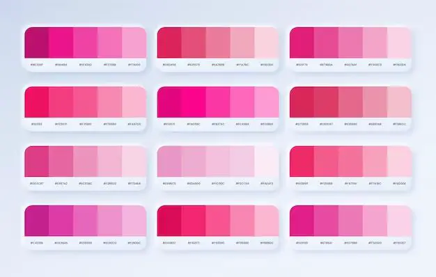
Pink is a beautiful and bright color that can really make things pop. But with so many shades of pink out there, how can you determine which one is the brightest? Let’s take a look at some of the brightest pink RGB values and how they are created.
How RGB Values Work
RGB stands for red, green, and blue. These are the three primary colors that can be combined to create all the colors in the visible light spectrum.
RGB values are specified using three numbers ranging from 0-255. Each number represents the intensity of that color. 0 means none of that color is present, while 255 is the maximum intensity.
By mixing different amounts of red, green, and blue, millions of possible colors can be produced. When all three values are equal, a shade of gray is produced. When all are at 255, pure white is the result.
For pink colors specifically, the red and blue values are increased while green is decreased. The higher the red and blue values, the brighter and more vibrant the pink becomes.
Common Bright Pink RGB Values
Here are some common bright pink RGB values and the shades they produce:
| RGB Value | Color Name |
|---|---|
| 255, 0, 255 | Magenta |
| 255, 0, 127 | Shocking pink |
| 255, 51, 153 | Candy pink |
| 255, 20, 147 | Deep pink |
| 255, 105, 180 | Hot pink |
| 255, 192, 203 | Pink |
As you can see, magenta (255, 0, 255) is the brightest possible pink, as the red and blue values are maxed out. Shocking pink (255, 0, 127) is also very bright with full red but half blue.
Hot pink (255, 105, 180) has slightly less blue than shocking pink, giving it a bold reddish-pink tone. Candy and deep pink have similar vibrancy, with candy pink being a bit lighter.
Standard pink (255, 192, 203) is quite a bit softer than the others, as the red and blue values are lowered. This gives it a more subtle, delicate look.
Achieving Maximum Brightness
To recap, the maximum brightness for pink is achieved when:
– Red is at 255
– Green is at 0
– Blue is as high as possible
Bringing the blue all the way up to 255 as well results in magenta. Stopping blue halfway at 127 produces shocking pink. For brightness with a distinctly pink rather than purple tone, keeping blue somewhere between 127-180 is ideal.
Other Bright Pink Options
Magenta and shocking pink are not the only choices for super bright pinks. Here are a few other vivid RGB values to consider:
| RGB Value | Color Name |
|---|---|
| 255, 51, 204 | Brilliant rose |
| 255, 0, 170 | French rose |
| 248, 3, 87 | Milano red |
Brilliant rose has full red and over halfway blue for serious punch. French rose dials the blue back just a bit for a rich pink. Milano red has minimal green and blue for a pink that borders on red.
All of these choices are vivid and eye-grabbing. It just depends on if you prefer a cooler, bolder pink or something slightly warmer.
Bright Pink RGB in Design
When using bright pink RGB values in design, a little can go a long way. These vivid shades are best used as accents rather than the main color scheme. Some examples:
– Using hot pink for headlines and call-to-action buttons against a white or black background. This draws the eye while preventing clashing.
– Adding a vivid pink overlay onto photos creates a colorful duotone effect.
– Using bright pink to style links in an otherwise neutral webpage design. This is an easy way to add pops of color.
– Choosing a soft dusty pink for backgrounds and layouts, with accents in a bolder magenta or shocking pink. The contrast looks stylish.
– Printing designs in black and white and using brilliant rose or French rose for any areas that you want to stand out.
Bright pink RGB values should be used sparingly, but they are perfect for making key elements prominent. Just avoid pairing extremely bold pinks together as it can become visually overwhelming.
Conclusion
The brightest pink RGB values occur when red and blue are at full intensity, with minimal green. Magenta (255, 0, 255) and shocking pink (255, 0, 127) are the pinkest, boldest options.
For vibrant pinks that skew slightly more reddish or purplish, values in the range of 255, 20, 147 to 255, 105, 180 work well. Brilliant rose, French rose, and Milano red are also vivid choices.
In designs, use bright pinks as accents against neutral backgrounds. Don’t overdo it, as these shades command attention and are best in small doses.
With the endless pink possibilities in the RGB color space, you can easily find the perfect bright, lively shade of pink for your needs. Have fun exploring all the eye-catching options!


