Choosing the right color scheme for an office environment is an important decision that can greatly impact the mood and productivity of employees. The color of walls, furniture, and decor affects how stimulated or relaxed people feel. For offices aiming to promote focus and reduce stress, experts recommend using calming, neutral colors. Cool tones like blues, greens, and grays are especially soothing. Bright reds or oranges can feel too energetic. The perfect office color depends on the nature of the work and goals for the space. With some thoughtful color selection, companies can create a calming yet inspiring office.
How Does Color Affect Emotions and Focus?
Colors have a psychological impact on people. Our brains react in different ways to various wavelengths of light that our eyes perceive as color. So filling an environment with certain shades can evoke emotional responses. Bright, warm colors like yellow and red stimulate the brain and increase heart rate and respiration. Cool, muted colors like blue and green have calming, relaxing effects. People concentrate better in cooler environments.
Research shows that office workers are more productive in blue rooms compared to red rooms. Blue evokes feelings of tranquility and encourages concentration. Red can feel energetic to the point of causing anxiety or agitation. Soft blues and greens are go-to office colors for reducing stress and eyestrain while supporting focus and clear thought.
Additionally, cool colors tend to visually recede in a space, which creates a sense of openness. Warm colors advance and appear more vibrant. Too much visual stimulation from bright warm tones can be distracting. Restful cool hues allow workers to focus without excessive environmental input.
Best Calming Color Choices for Offices
Here are the top color choices for promoting tranquility in office environments:
Soothing Neutral Tones
Neutral whites, grays, and beiges are mild backdrop colors that won’t overstimulate. They allow pops of color from artwork, furniture, or branding elements to stand out without competing. Neutrals create a clean, minimalist look.
Light gray is an especially calming neutral. It evokes feelings of stability and relaxation. Soft beiges or greiges (beige-gray mixes) also provide subtle warmth without being distracting.
Cool Blues
Shades like airy sky blue, placid teal, or relaxing indigo blue are wonderful calming office colors. The cool blue spectrum lowers heart rate and instills feelings of tranquility. Blue also boosts productivity and clear thinking.
Light periwinkle blue is a soft, peaceful option for walls. Deeper tones like navy can be great for accents that don’t overwhelm. Avoid bright, electric blues which stimulate energy like warm colors.
Muted Greens
Earthy sage greens, mossy olive tones, and muted jade are ideal calming greens. They conjure feelings of balance and renewal from nature. Green symbolizes life and harmony. It can aid concentration while also relieving eye fatigue from computer use.
Deeper emerald greens work well for feature walls or as an accent pop of color. Keep brighter lime greens or neons to a minimum, as they act more like stimulating greens.
Professional Grays
While any neutral gray helps moderate stimulation, some specific shades stand out for office spaces. A mid-range steel gray evokes stability and strength. Soft, hazy shades like taupe or mushroom gray provide subtle depth. Charcoal gray is a classic color of leadership and sophistication.
Professional grays work for any office position and many industries. They project competence and focus while allowing other colors to stand out.
| Color | Psychological Effects |
|---|---|
| Light Blue | Peaceful, tranquil, focused |
| Soft Green | Balanced, renewed, harmonious |
| Neutral Grays | Stable, professional, calm |
| Warm Tones | Energetic, stimulating, lively |
How to Incorporate Calming Colors in Offices
There are many ways to integrate soothing hues for a relaxed office:
Wall Colors
Painting office walls in restful colors establishes an environment’s overall tone. Light blue, muted green, or soft gray walls set a tranquil mood. Consider accent walls in bolder tones like navy or olive. Wall color can also demarcate different work zones.
Furniture
Choosing neutral-toned furniture prevents visual clutter. But colored furniture in soothing hues like pale blue or gray-green can provide an extra tranquility boost. Upholstered chairs in soft fabrics appear especially relaxed against simple backgrounds.
Decorations
Elements like rugs, plants, artwork, and accessories let you incorporate color more freely. Nature photography and abstract art in cool tones enhance peacefulness. Pops of muted colors like throw pillows or rugs feel energizing but not jarring. Plants boost mental well-being while also literally purifying office air.
Lighting
Proper lighting prevents eye strain while cool-toned lamps or fixtures reinforce relaxation. indirect ambient lighting avoids glare. Task lighting at desks helps focus without feeling harsh. Natural light exposure is ideal for productivity and mood.
Zones and Details
Use color to define different workspace zones for varied tasks like independent work, collaboration, or relaxation. Pick relaxing colors for break room details like cafe-style seating. A genuinely calming office attends to all aspects of the environment.
Examples of Calming Office Color Schemes
Some examples of tranquil office color palettes include:
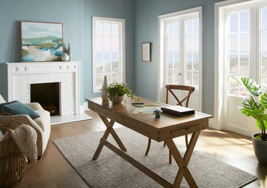
Light Blue and Taupe
– Pale sky blue walls
– Taupe gray office furniture
– Navy blue accent chairs
– Metallic decor for subtle shine
This airy blue office scheme feels uplifting yet restful. Warm taupe furniture and decor offsets the cool blue for perfect balance.
Sage Green and Mushroom Gray
– Soft sage green walls
– Rich mushroom gray divider screens
– Dark wood desk surfaces
– Rustic textural decor elements
Earthy green tones complemented by deep, sophisticated grays create natural harmony. Woodsy decor enhances the organic vibe.
Minimalist Neutral
– Bright white walls and ceiling
– Gray fabric furniture
– White task lighting
– Metallic gold decor accents
– lush potted plants
Clean, light neutral backgrounds let vibrant green plants become the focal point. Little color allows minds to rest easy.
Conclusion
A tranquil office environment relies on calming colors that reduce stimulation and eyestrain while boosting focus and relaxation. The best office colors for promoting serenity and productivity are cool blues, muted greens, soft taupes and grays, and neutral white backdrops. Pops of color from plants, art, lighting fixtures, furniture, and decor elements prevent spaces from feeling stale without being distracting.
Companies should choose a soothing yet inspiring color scheme attuned to their workspace needs and employees’ sensitivities. The ideal peaceful office environment incorporates calming colors throughout every zone and detail. Thoughtful color selection can make a significant impact on work quality, morale, and wellness. With both function and mental health in mind, even the busiest office can become an oasis of tranquility.
