Tone and shade are important concepts when it comes to color and color theory. At a basic level, tone refers to how light or dark a color is, while shade refers to a variation of a color made by adding black to it. Understanding these terms allows for more effective color mixing and usage. Let’s explore what exactly tone and shade mean and how they are used.
Defining Tone
The tone of a color describes its lightness or darkness. It is determined by how much black or white is mixed into the color. Adding white makes a color lighter and increases its tone, while adding black makes it darker and decreases its tone. For example, a lemon yellow has a higher tone than mustard yellow because it has more white in it. Tones are seen as different levels on the grayscale.
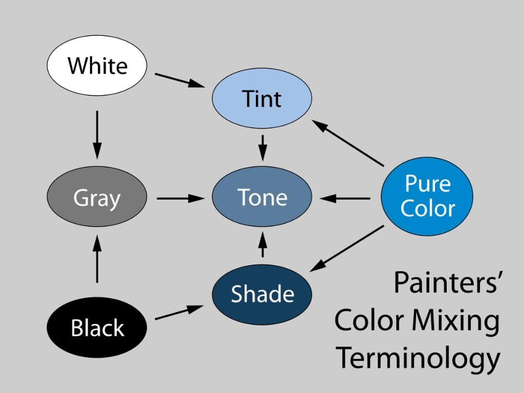
On the tone scale, the lightest tones are referred to as tints. Mixing a high amount of white into a color creates a tint. As tones get progressively darker, they are called tones, shades, and finally shades. A middle grey area is referred to as a tone. Darker tones with more black added are called shades. And the very darkest tones just before pure black are shades.
Tones are often described with words like light, medium-light, medium, medium-dark, and dark. A color may have several variations across the tonal scale. For instance, azure blue could have a very light tint, a light tone, a medium tone, dark tone, shade, and so on. Understanding how to mix different tones is an important skill for painters and designers.
Defining Shade
Closely related to tone, a shade is specifically a darker value of a color made by adding black to it. As black is added, it reduces brightness and saturation, moving the color towards black. Adding just a small amount of black makes a low-chroma shade, while adding more black progressively darkens the shade.
For example, forest green is a darker shade of lime green. And navy blue is a very dark shade of azure blue. The more black that is mixed in, the lower the tone becomes until eventually it may be classified as a shade rather than just a tone.
Like tones, shades may be described with labels indicating their darkness level, such as light shade, medium shade, dark shade, and so on. Creating a range of shades for a key color helps to develop a robust color scheme with depth and nuance.
The Relationship Between Tone and Shade
While tone and shade have distinct definitions, they are very closely linked concepts. All shades by definition have low tones, as adding black reduces lightness. However, tones encompass both tints and shades. For example, a tint with high white content may be classified as a light tone. And a shade with high black content classified as a dark tone.
Tone refers to where a color falls along the tonal scale from tint to shade. Shade refers specifically to colors on the darker end of that scale. So all shades are tones with low values, but not all tones are shades.
Some examples to illustrate:
- Baby blue is a tint with a high tone.
- Sky blue is a tone around the mid-tones.
- Navy blue is a shade with a low tone.
Understanding this interplay allows artists to deliberately manipulate tones and shades to achieve the visual effect they desire. It takes experience and a skilled eye to master color tones and shades in practice.
The Importance of Tone and Shade
Tone and shade may seem like subtle concepts, but they have an immense impact on the look, feel, and mood of visual art. The tones and shades used in an image or design determine the contrast, palette, lighting, and overall atmosphere.
In painting, tones help to create the illusion of form and depth through value. Areas of light and shadow establish shape and perspective. And a balanced tonal range prevents a flat or muddy look. From the vibrancy of the highlights to the mystery of the shadows, tones bring life and dimension to artwork.
In graphic design and digital art, adjusting tone and shade allows for sophisticated highlighting and shading. Tones establish focal points and direct the viewer’s attention. Soft tonal transitions create visually pleasing effects. Shade adds moodiness and drama. Tones can be leveraged to complement colors and unify branding.
In fashion and interior design, shades enrich colors and tie together cohesive palettes. Light tints pop against darker shades. Combining tones and shades adds visual interest and depth in everything from clothing prints to upholstery.
Across disciplines, manipulating tone and shade creates contrast, prioritizes elements, defines space, communicates style, and elicits emotion. A strong grasp of tone and shade gives artists more effective tools for expression.
How to Mix and Adjust Tones and Shades
Learning to mix and adjust tones and shades takes practice in observing subtle color and value changes. But there are techniques and principles that can help.
Key Tips for Mixing Tones
- Add white to lighten a tone and black to darken it. Start with small amounts and adjust as needed.
- To make tints, add white in portions until the desired lightness is reached.
- To make tones, add both white and black sparingly to medium the color.
- To make shades, add black in portions until the desired darkness is reached.
- Add complementary colors to dull a tone or make it more neutral.
- Work systematically from lightest tint to darkest shade to map out the tonal scale.
- Use a value scale as a guide, marking tones from a 1 to 10 value.
Key Tips for Adjusting Shades
- Start with the base color and add black slowly until it darkens noticeably.
- Adding too much black can make shades muddy. Build up shadows gradually in thin transparent layers.
- For natural shading, use complementary colors like purple with yellow instead of just black.
- Use darker shades in shadow areas and to recede elements, creating depth.
- Place lighter shades in highlighted areas to draw interest and define form.
- Shade backgrounds darker to make subjects pop visually.
With these tips in mind, artists can strategically blend tones and shades to craft cohesive palettes and make elements stand out compositionally through contrast. The magic is in the nuance of gradual shifts from light to dark.
Common Types of Tones and Shades
There are some common types of tones and shades that are useful to be aware of when working with color.
Common Tones
- Tint: Very light tone with high amounts of white
- Pastel: Soft light tone with white and desaturation
- Tone: Intermediate tone around the mid-tones
- Neutral: Tone desaturated with greys and browns
- Earth tone: Neutral tones of browns, tans, ochres, etc.
Common Shades
- Low-chroma: Shade with minimal black added
- Shade: Darker tone with notable black content
- Dark shade: Very dark tone near black
- Muted: Shade desaturated with grey and black
- Dusky: Soft low saturation shade
These labels can be combined to precisely describe tones and shades, for example “light muted tone” or “medium dusky shade.” Familiarity with these terms assists in communicating about color adjustments.
Using Tones and Shades in Composition
Skilled use of tones and shades contributes tremendously to the visual impact of an artwork or design. Here are some key compositional techniques for tones and shades:
- Value contrast: Use stark light/dark contrast to make elements stand out.
- Tonal gradation: Soften edges with gradual tone and shade transitions.
- Balanced range: Distribute the full tonal scale evenly for harmony.
- Emphasizing: Draw focus with light tints against dark shades.
- Defining shape: Build form through graduated shifts in tone.
- Establishing dominance: Make subjects pop with higher contrast.
Skillful tonal composition creates visual interest, directs the viewer’s eye, defines spaces and objects, and creates cohesion. Whether using tones and shades subtly or dramatically, the artist controls the experience through value.
Tones and Shades in Artistic Color Theories
Many seminal artistic color theories provide frameworks for working with tones and shades in painting and design.
Key Theories Involving Tone and Shade
- Chiaroscuro: Contrast of light and dark tones to create drama.
- Impressionism: Focus on accurately capturing light tones and colors.
- Cubism: Fragmented planes defined by shifts in tone.
- Bauhaus: Tone variation to communicate form and function.
- Art Deco: Bold geometric shapes with tone gradation.
From Leonardo da Vinci’s sfumato blurring to Johannes Itten’s value scales, tone has been used to powerful effect throughout art history. Understanding these movements provides deeper insight into composition with tones.
Using Tonal Variation in Design and Photography
In modern digital art, graphic design, photography, and image editing, adjusting tones can make a big impact. Some examples include:
- Darkening background tones in portraits to make subjects pop
- Boosting contrast and crushing tones for dramatic black-and-white conversion
- Adding tone variation with dodge and burn photo editing techniques
- Using a full tonal gradient in logo design to add depth and dimension
- Softening harsh shadows with gradual tonal falloff
When working digitally, tones can be precisely measured with value scales and adjusted with effects like curves for high level control.
Tones and Shades in Decor and Fashion
Beyond fine art, manipulating tone and shade has applications in interior decorating, product design, fashion, and more. Some examples include:
- Using light tints and airy tones to give a sense of space and brightness
- Grounding a scheme with dark shades as anchor colors
- Making accent colors pop with greater tone separation
- Communicating elegance with soft dusky neutrals and pastels
- Creating depth with tone-on-tone texture and pattern variations
Adjusting tones and shades of patterns, fabrics, paints, and decor elements creates cohesive, polished looks suited to specific aesthetics and moods.
Tools for Measuring and Mixing Tones and Shades
To work effectively with tones and shades by hand or digitally, artists use tools like:
- Value scales: Charts with sets of graduated tones from white to black.
- Grayscales: Monochrome gradients useful for gauging tones.
- Color wheel: Shows tone variations and complementary shades.
- Color mixer: Digital tool to preview and adjust color tones.
- Eyedropper: Samples colors to match tones and shades.
With the help of these aids, subtle tonal shifts can be deliberately controlled and calibrated for any medium.
Conclusion
Tone and shade are fundamental building blocks for working with color across all visual arts. The spectrum from tints to shades creates the lights, darks, and everything in between that makes color come alive. Mastering tone gives artists the power to direct the eye, sculpt form, and create mood in their visual compositions. From the soft glow of a pastel tint to the rich depth of a dusky shade, the nuance of tones and shades makes all the difference.
