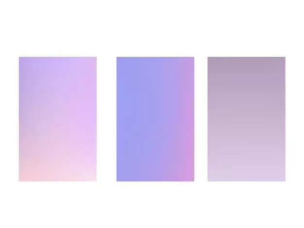
Purple is a classic, regal color that has been popular throughout history. In print design and publishing, the CMYK (cyan, magenta, yellow, black) color model is most often used. Choosing the right CMYK values is important for accurately reproducing purples in print. But with so many shades and tints to pick from, how do you know what makes a good, versatile CMYK purple?
What is CMYK?
CMYK stands for cyan, magenta, yellow and black. These four color inks are used in combinations to create all the colors in printed materials.
Cyan, magenta and yellow are the secondary colors. When printed together in equal amounts, they create a mid-range neutral dark gray.
Black ink is added to deepen colors and allow accurate reproduction of darker shades.
The percentage values of each ink are what define the resulting color. For example:
- 0% of all inks makes white
- 100% cyan, magenta and yellow together create black before black ink is added
- 100% of one ink with 0% of the others makes the pure ink color – so 100% magenta ink gives you the pure magenta tone
By varying the percentages, millions of colors can be created from these 4 inks.
How CMYK Purples Are Created
There are a few ways to make purple colors in CMYK:
Magenta + Blue
One way is to combine magenta ink with cyan ink to create purple tones.
More magenta ink in the mix pushes the purple towards a reddish, raspberry tone. More cyan makes a cooler, bluer purple.
Magenta + Black
Another way is adding black ink to magenta. This darkens the magenta and also neutralizes it somewhat.
The more black is added, the darker and less intense the purple becomes. Adding up to 60% black to magenta creates nice dark purple shades.
Magenta + Cyan + Black
Combining all three – magenta, cyan and black inks – allows even more versatility in mixing purples. The full spectrum from light purple tones to deep, dark purples can be created.
Choosing a Versatile CMYK Purple
So what exactly makes a good, versatile CMYK purple? Here are some tips:
Aim for Darker & Less Saturated Purples
Darker, less saturated purples tend to be more versatile and easier to work with. Very light purples can look washed out and be hard to read black text over. Very vivid, intense purples can be overwhelming and difficult to pair with other colors.
Somewhere in the middle is best – not too light and muted but not too electric and bright. Deep plummy purples, eggplant purples, and darker lavender purples are flexible options.
Watch Out for Metamerism
This is when colors look different under different light sources. It can be an issue with some purples. Make sure to preview your chosen purple both on screen and printed out to check it looks ok under all conditions.
Aim for Neutral Undertones
Try to avoid purples with strong red, blue or pink undertones. These can look jarring or clash with other colors. Neutral undertone purples are more versatile for general use.
Consider Tints of Purples Too
Don’t just think of purple solid colors. Try out lighter tints by adding cyan and/or yellow. These can provide some nice accent colors that still have a hint of purple.
Examples of Good CMYK Purples
Here are some examples of flexible, versatile CMYK purples to try:
| CMYK Values | Preview |
|---|---|
| 60, 100, 0, 0 | |
| 50, 100, 0, 0 | |
| 50, 70, 0, 0 | |
| 30, 100, 0, 0 | |
| 60, 80, 20, 0 | |
| 50, 60, 30, 0 | |
| 40, 90, 30, 0 | |
| 30, 70, 0, 0 | |
| 60, 40, 0, 0 |
These samples stick to darker, cooler purples. Magenta is combined with cyan and black to create nice depth without being overpowering. Neutral undertones make them flexible to work with.
Using Purples in Designs
Here are some quick tips for working with CMYK purples in your designs:
- Use as accent colors with black and white for high contrast.
- Pair with dark cool colors like blues, greens and grays.
- Use tints of purple for backgrounds and as secondary colors.
- Add white space and neutral elements to balance intense dark purples.
- Limit use of light purples to avoid washed out look.
- Make sure text is dark enough to read over purple backgrounds.
With a well chosen CMYK purple, you can give designs a classic, upscale look. Just keep versatility and legibility in mind.
Conclusion
CMYK purples are created by combining percentages of magenta, cyan and black inks. Choosing the right mix allows you to produce various purple tones for print design. Aim for deep but not too vivid purples. Neutral undertones and medium saturation creates maximum flexibility. Mix in tints of purple for accent colors. And make sure your purples look good under different lighting. With some careful testing and a preview of printed samples, you can find the perfect CMYK purple for your next project.


