What are complementary colors?
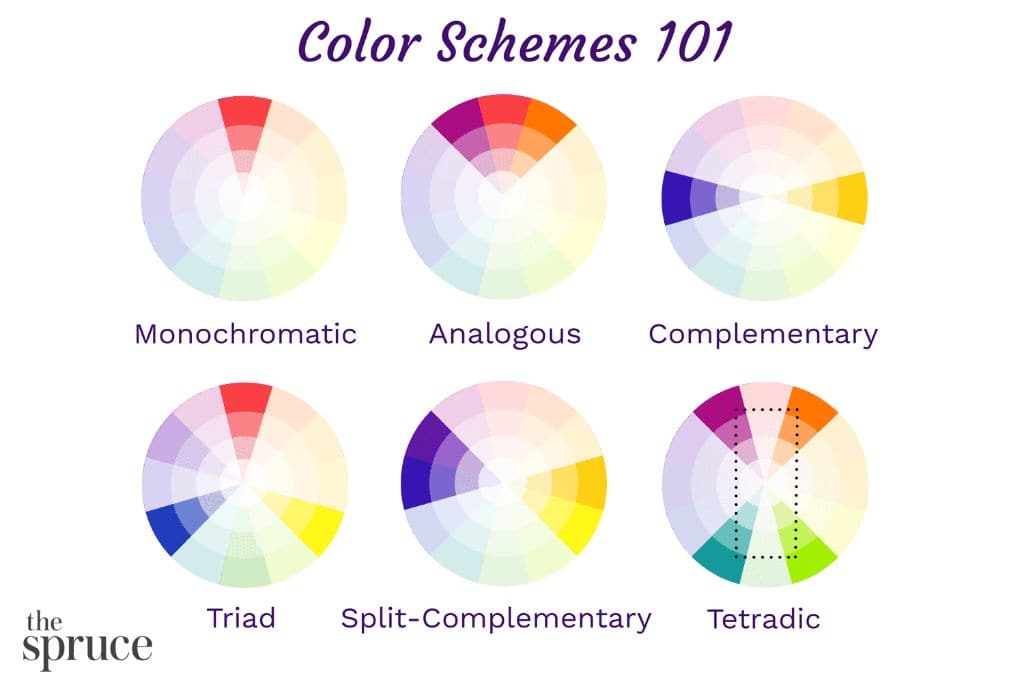
Complementary colors are pairs of colors that are opposite each other on the color wheel. The color wheel organizes colors into 12 basic hues – red, red-orange, orange, yellow-orange, yellow, yellow-green, green, blue-green, blue, blue-violet, violet, and red-violet. Complementary colors are located directly across from each other on the wheel. For example, red and green are complements, as are yellow and purple.
When complementary colors are placed next to each other, they create the strongest contrast of any color combination. This contrast is due to the colors’ brightness and intensity. Complementary colors are sometimes referred to as “opposites” because they seem to logically oppose each other. However, putting complementary colors together can create color harmony and vibrancy.
Key characteristics of complementary colors
There are a few key characteristics of complementary color schemes:
– They are opposite colors on the color wheel
– They create strong visual contrast when put side-by-side
– They enhance and intensify each other
– They create a vibrant look when combined in the right way
– Examples include red & green, blue & orange, purple & yellow
– One color is not usually used in a larger quantity than the other
Why use complementary colors in art?
Complementary color schemes offer several benefits when used in works of art:
– Create strong focal points. The high contrast draws the viewer’s eye.
– Convey energy and excitement. The vibrancy is visually stimulating.
– Provide balance. No color dominates, so there is equality.
– Add dimensionality. Differences in complements creates perspective.
– Enable color harmony. Even though they contrast, they work together.
– Draw attention. Viewers notice the dynamic color interplay.
– Complementary colors make a statement and are difficult to ignore. Using them together well takes skill but can result in captivating artwork.
Examples of complementary color schemes in art
Many renowned artists have expertly used complementary colors in their paintings and other works:
| Artist | Artwork | Complementary Colors Used |
|---|---|---|
| Vincent van Gogh | The Starry Night | Blue and yellow |
| Claude Monet | Impression, Sunrise | Blue and orange |
| Piet Mondrian | Composition II in Red, Blue, and Yellow | Red and blue-green |
| Wassily Kandinsky | Several Circles | Blue and yellow |
As you can see, well-known painters have made ample use of complementary color combinations like blue and orange or red and green to make their works visually striking. The contrasts create dynamism and focal points.
Tips for using complementary colors effectively
If you want to use complementary colors successfully in your own artwork, here are some tips:
– Use complements in similar proportions to create balance. Don’t let one color dominate.
– Try combining complements with white, black, or gray for softer contrast.
– Put lighter shades of complements next to darker shades for more nuance.
– Complement with split complements (three color scheme) for more variety.
– Test colors first before committing them to an artwork. Sample on a palette.
– Observe the effects closely. Complements can overwhelm if not deftly used.
– Look at art you admire and analyze the color combinations.
– Work with analogous colors if complements are too intense.
Proper use of complementary colors takes practice. But the payoff can be stunning works full of vibrancy, contrast, and visual magnetism. Learning color theory is key for any artist.
Color wheel showing complementary colors
| Primary Color | Complementary Color |
|---|---|
| Red | Green |
| Blue | Orange |
| Yellow | Purple |
This table displays the primary complementary color pairs. Red and green are complements, blue and orange are complements, and yellow and purple are complements. These opposing colors create the highest contrast when placed together.
Famous artworks using complementary colors
Many iconic paintings and other artworks make highly effective use of complementary colors:
| Artwork | Artist | Complementary Colors |
|---|---|---|
| The Scream | Edvard Munch | Greenish-blue and orange |
| Broadway Boogie Woogie | Piet Mondrian | Red and blue-green |
| Water Lilies | Claude Monet | Orange and blue |
| The Persistence of Memory | Salvador Dali | Yellow and violet |
As shown, famed artists like Munch, Mondrian, Monet, and Dali all used complementary colors to make their paintings vivid and eye-catching. The strategic placement of complements draws the viewer in.
Complementary color schemes in modern graphic design
Complementary colors remain an impactful tool in modern graphic design as well:
| Company | Industry | Complementary Colors Used |
|---|---|---|
| Spotify | Music streaming | Green and yellow |
| IKEA | Furniture | Blue and orange |
| Nickelodeon | Television | Orange and green |
Brands like Spotify, IKEA, and Nickelodeon all use complementary color schemes in their logos and branding for high visual impact. This shows complementary colors remain an effective technique even in the digital age.
Conclusion
In summary, complementary colors are color pairs located opposite each other on the color wheel. Complementary color schemes offer strong contrast and vitality but can be challenging to use effectively. Many famous artists and painters have expertly combined complements like blue and orange or red and green to create visually striking works full of energy. Modern designers also continue to use complementary colors for bold, eye-catching graphic design. With practice, complementary colors can make artwork pop off the page.
