Colors can have a powerful impact on our emotions and perceptions. Some colors appear more vibrant and eye-catching than others. But which colors are the most vibrant exactly? Here we will examine the science behind color vibrancy and look at examples of the most vibrant colors.
How Color Vibrancy is Measured
The vibrancy or intensity of a color depends on several factors:
- Hue – The actual color shade such as red, blue, yellow.
- Saturation – How pure or rich the color is, without added white, gray, or black.
- Brightness/Lightness – How light or dark the color appears.
- Context – Surrounding colors impact perceived vibrancy.
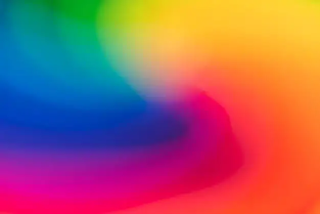
Vibrant colors are often very saturated, meaning they contain a maximum concentration of hue with minimal white, gray, or black added. They also tend to be relatively bright rather than dark. However, context matters as well. A color may pop out more when surrounded by muted tones.
Most Vibrant Primary & Secondary Colors
The most vibrant colors are often primary and secondary colors in their purest saturated form. Primary colors are red, blue, and yellow. Secondary colors are made by mixing two primary colors, resulting in orange, green, and purple.
Here are some of the most vibrant shades of the primary and secondary colors:
| Color | Specific Shades |
|---|---|
| Red | Scarlet, Crimson, Ruby, Cherry |
| Blue | Electric Blue, Cerulean, Sapphire |
| Yellow | Lemon, Canary, Neon |
| Orange | Fire orange, Sunset orange, Neon orange |
| Green | Lime green, Emerald green, Neon green |
| Purple | Fuchsia, Orchid, Amethyst, Lavender |
These shades appear brightly saturated and intense. They exhibit the qualities of vibrancy when viewed in isolation or surrounded by more muted tones.
Most Vibrant Tertiary & Complementary Colors
Vibrant tertiary colors are made by mixing one primary color with one secondary color. For example, mixing red and orange makes red-orange. Complementary colors are located opposite each other on the color wheel, like red and green.
Here are some vivid tertiary and complementary color combinations:
| Color | Shades |
|---|---|
| Red-orange | Vermilion, Coral |
| Yellow-orange | Amber, Goldenrod |
| Yellow-green | Chartreuse, Lime |
| Blue-green | Turquoise, Teal |
| Blue-violet | Indigo, Peacock |
| Red-violet | Magenta, Fuchsia |
| Complementary | Red & Green, Orange & Blue, Yellow & Purple |
These shades incorporate the vibrancy of primary and secondary colors into fresh color combinations. Adjacent shades on the color wheel maximize contrast for unique pop.
Most Vibrant Accented Neutrals
Neutral colors like white, black, gray, and brown can take on a bold, vibrant personality when accented with a shot of color. Here are some examples of neutral tones brought to life:
- White decorated with electric blue, fuchsia, or citrus accents
- Gray punctuated by neon pink, lime, or teal details
- Black set off with ruby, canary, or violet undertones
- Brown enlivened by tangerine, seafoam, or magenta touches
The neutral backdrop makes the bright colors really stand out without becoming overwhelming. This is a great way to add pops of vibrancy in a balanced way.
Most Vibrant Nature-Inspired Colors
Nature contains many vivid colors, which can be captured and translated into pigments. Here are some quintessentially vibrant nature-based colors:
- Sunflower: Vivid yellow with a hint of orange
- Radish: Fresh pinkish-red
- Sea green: Bright aquatic teal or green-blue
- Sunset: Warm orange, red, and yellow tones
- Berry: Rich shades of blue, purple, red, and magenta
- Lemon/Lime: Zingy saturated yellow greens
- Coral: Vibrant reddish-orange
These colors reflect the vitality and intensity found in the natural world. Pigments derived from minerals, plants, and animals showcase nature’s spectrum in an eye-catching way.
Most Vibrant Warm & Cool Colors
Colors are often categorized into warm and cool families. Warm colors like red, orange, and yellow energize and excite. Cool colors like blue, green, and purple are calming and refreshing.
The most vibrant warm colors include:
- Scarlet: Vivid red with orange undertone
- Lava: Highly saturated fiery red-orange
- Laser Lemon: Neon, acidic yellow
- Heat Wave: Pure intense orange, reminiscent of flames
The most vibrant cool colors include:
- Electric Blue: Pure, shocking blue
- Neon Green: Extremely bright, radioactive green
- Purple Orchid: Rich, jewel-toned purple
- Arctic Ice: Crisp, intense icy blue
Both warm and cool sides of the color wheel contain options for creating an eye-catching focal point.
Most Vibrant Multicolor Combinations
For maximum vibrancy, you can combine multiple pure, saturated colors together. This creates visual energy and interest. Here are some examples of vibrant multicolor combinations:
- Neon rainbow: All the colors of the visible spectrum in their most saturated neon versions
- Fiesta: Vibrant reds, oranges, greens, blues, and purples reminiscent of Mexican party decor
- ’80s retro: Electric blue, magenta, neon orange, lime green
- Fruit salad: Mixing lush berry tones, melon shades, lemon, lime, and cherry
- Spice rack: Rich shades of cinnamon, paprika, saffron, clove, cumin, and nutmeg
Blending multiple vivid shades creates energetic, lively color combinations. This is a great way toGrab attention and convey excitement.
Most Vibrant Color Contrasts
Maximum color contrast also amplifies vibrancy. Adjacent highly contrasting colors make each one seem more bold and intense. Here are some examples of high contrast pairings:
| Color 1 | Color 2 |
|---|---|
| Orange | Electric Blue |
| Lime Green | Violet |
| Yellow | Fuchsia |
| Turquoise | Fire Engine Red |
These complementary or opposite colors on the color wheel maximize contrast when paired. This makes both colors appear more bold and eye-catching.
Most Vibrant Colors in Marketing & Branding
Vibrant colors are commonly used in marketing, advertising, signage, and branding to attract attention. Here are some examples of brands using highly saturated, intense colors:
- Coca-Cola: Deep red
- Target: Vibrant red and white
- YouTube: Cherry red icon and bright red accents
- TicTacs: Lime green containers
- Nickelodeon: Splatters and swirls of neon orange, green, and purple
- Amazon: Vibrant orange-yellow logo with accompanying black arrow
These memorable brand colors are highly energetic and recognizable. They help companies stand out in the market. Vibrant colors invoke excitement and are bold enough to attract consumer attention.
Most Vibrant Colors for Home Decor
Vibrant colors can make a strong impact when decorating a home. They create an energizing backdrop. Here are some ways to effectively incorporate vibrant colors for home decor:
- Paint an accent wall in a saturated coral, mustard, or teal tone
- Use vibrant colored artwork, pillows, and area rugs as bold focal points
- Add bright kitchen appliances like cherry red stand mixers or sunshine yellow blenders
- Choose window treatments in vibrant hues like emerald or violet
- Incorporate neon rainbow details and decor in a kids’ room
- Paint the front door an impactful hue like cobalt or marigold
Strategically using vibrant colors in high visibility areas helps create an energetic, uplifting mood. Vibrant accents inject visual interest into any living space.
Most Vibrant Colors for Fashion
Vibrant shades make an eye-catching style statement in fashion. They convey boldness and confidence when worn. Some of the most vibrant colors for fashion include:
- Sapphire blue
- Emerald green
- Cobra orange
- Fire engine red
- Electric purple
- Lemon yellow
- Fuchsia pink
- Lime green
These vivid chromatic colors pack a fashion punch when incorporated into clothing, shoes, jewelry, handbags, sunglasses, and other accessories. They create an energetic modern look.
Most Vibrant Colors Based on Lighter & Darker Shades
A color’s vibrancy is impacted by how light or dark it is. In general, lighter and brighter shades appear more vibrant, while darker shades seem more subdued. Here are some examples:
| Light/Bright | Dark |
|---|---|
| Neon orange | Burnt orange |
| Lemon yellow | Mustard yellow |
| Hot pink | Mauve pink |
| Mint green | Forest green |
The lighter versions have more pop and intensity. However, darker shades can provide an elegant vibrancy in some contexts, especially when accented with lighter tones.
Most Vibrant Colors for Grabbing Attention
Vibrant colors naturally draw the eye thanks to their high saturation. They are ideal for grabbing attention. Some of the most attention-grabbing vibrant colors include:
- Neon yellow
- Lava orange
- Hot pink
- Acid green
- Electric purple
- Cerulean blue
These high intensity shades stand out from muted environments. They pull focus effectively when used on signage, packaging, websites, documents, and more. Vibrant colors are eye magnets.
Most Vibrant Colors for Conveying Energy
Color psychology indicates vibrant colors convey energy, excitement, youth, and vibrancy. They create visual dynamism and motion. Some energetic colors include:
- Fire engine red
- Sunshine yellow
- Electric blue
- Neon orange
- Hot pink
- Acid green
These colors appear energetic on their own and create a sense of vigor, speed, and brightness when viewed. They bring to mind pulses of energy and electricity.
Most Vibrant Colors for Contrasting Muted Environments
Introducing a vibrant color into a muted or neutral setting makes it really pop. The dull backdrop amplifies the intensity of the vibrant hue. Examples of muted environments to effectively contrast vibrant colors include:
- White walls and neutral home decor
- Gray office spaces and cubicles
- Beige commercial buildings and exteriors
- Off-white websites and documents
- Muted earth tone fashion lines
Injecting a neon yellow chair, fuchsia pillow, turquoise poster, or magenta shirt into these landscapes spotlights the vibrant color. The drabness of the environment makes the color seem extra eye-catching and dazzling.
Conclusion
Vibrant colors grab attention, convey energy, and create visual dynamism. The most vibrant colors tend to be primary, secondary, and complementary hues at their maximum saturation and lightness levels. Examples include electric yellow, cherry red, neon orange, acid green, and sapphire blue. Strategically using the most vibrant colors pays off when you want to grab attention, energize a space, or make a bold statement.
