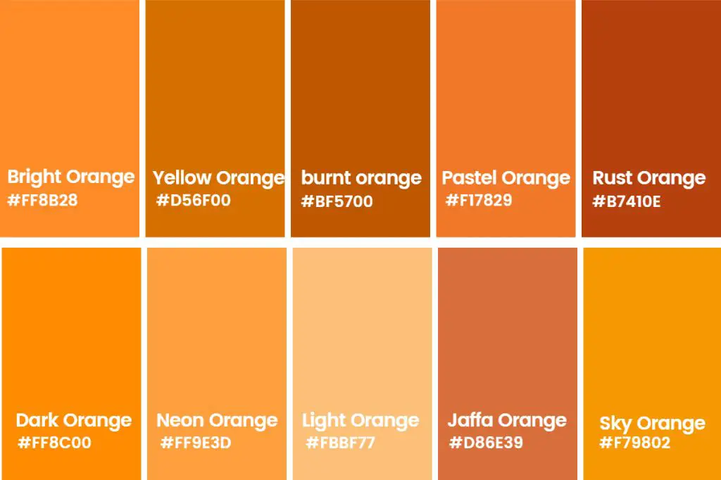
Orange is a vibrant and dynamic color that pairs well with many shades. When decorating, crafting, or selecting clothing, it can be helpful to know what other colors look appealing with orange. Here are some of the colors that are the closest matches and complements to orange.
Warm hues similar to orange
Some of the warmest shades that are similar to orange include:
- Peach
- Coral
- Salmon
- Terracotta
- Peachy pink
- Melon
- Apricot
- Gold
These colors all sit next to orange on the color wheel and share similar warm undertones. Peach is the lightest of the group, with a soft, delicate appearance. Coral and salmon increase intensity while keeping a hot pink undertone. Terracotta and apricot bring in more brown for an earthy, baked clay look. Melon and peachy pink add a touch more red to mimic the inside of ripe fruit. Gold takes orange into a metallic, radiant direction.
Red-orange hues
If you want to accentuate the red undertones in orange, these shades are excellent choices:
- Vermilion
- Scarlet
- Cinnamon
- Rust
- Persimmon
- Tomato
- Coral red
Vermilion, scarlet, and coral red sit between red and orange on the color wheel. They amplify the fiery boldness of orange. Cinnamon, rust, and persimmon add a note of brown for a warmer, autumnal look. Tomato infuses orange with more pink for a zesty color.
Yellow-orange tones
To give orange a sunnier, tropical look, blend it with yellow:
- Amber
- Saffron
- Cantaloupe
- Peach-yellow
- Butterscotch
Amber and saffron are vivid golden yellows. Cantaloupe and peach-yellow are softer, more pastel versions. Butterscotch adds a touch of brown for a creamy, caramel hue.
Orange-red mixes
Certain shades marry true orange with strong red notes:
- Fire engine red
- Blaze orange
- Sunset orange
- Bittersweet
Fire engine red is an emergency vehicle color that pops against black. Blaze orange attracts attention, perfect for hunters. Sunset orange and bittersweet capture the warm glow of a setting sun. These colors demand to be looked at.
Orange-adjacent neutrals
Some neutral browns and tans sit close enough to orange to complement it well:
- Ochre
- Buff
- Khaki
- Tan
- Beige
- Fawn
Ochre, buff, and khaki have yellow-orange undertones. Tan and beige are more subtle neutrals. Fawn introduces a grayish element. These earthy shades provide an organic contrast to bright orange.
Vibrant secondary colors
Opposite orange on the color wheel are strong secondary colors:
- Lime green
- Emerald green
- Teal
- Cerulean blue
- Cobalt blue
- Violet
Fresh greens like lime and emerald energize orange. Teal and cerulean blue offer a cool oceanic contrast. Cobalt punches up the intensity. Violet balances orange with a complementary pop.
Muted tertiary colors
Softened tertiary colors also suit orange nicely:
- Chartreuse
- Seafoam green
- Mint
- Aquamarine
- Periwinkle
- Lavender
Tertiary mixes like chartreuse, mint, seafoam green, aquamarine, lavender and periwinkle have lower saturation than primary and secondary colors. Their subtlety helps balance out orange’s bold impact.
Monochromatic orange hues
Playing with different shades, tints, and tones of orange can also be attractive:
| Shade | Tint | Tone |
|---|---|---|
| Burnt orange | Peach | Terracotta |
| Rust | Melon | Ochre |
| Red orange | Salmon | Clay |
Shades like burnt orange and rust use black to darken orange. Tints including peach, melon and salmon lighten it with white. Clay, ochre, and terracotta are orange tones, muted by gray.
Split complementary orange combos
Split complementary color schemes use colors on either side of orange’s complement (blue) for lots of contrast:
| Orange | Split Complement 1 | Split Complement 2 |
|---|---|---|
| Peach orange | Yellow-green | Violet |
| Burnt orange | Sea green | Blue-violet |
| Bittersweet orange | Lime | Indigo |
These combinations use an orange with a color next to blue and a color next to orange’s complement (blue). This creates a high-contrast, vibrant look.
Analogous orange combinations
Analogous schemes use hues right next to each other on the color wheel for harmony:
| Orange | Analogous Color 1 | Analogous Color 2 |
|---|---|---|
| Tangerine | Peach | Red-orange |
| Pumpkin | Burnt orange | Rust |
| Coral | Salmon | Pink |
Grouping tangerine with peach and red-orange creates a fruit salad color scheme. Pumpkin, burnt orange, and rust evoke an autumn motif. Coral paired with salmon and pink suggests tropical flowers and sunsets.
Orange tetradic combinations
Tetradic (also called double complementary) palettes juxtapose colors from opposite sides of the color wheel:
| Orange | Complement 1 | Complement 2 | Complement 3 |
|---|---|---|---|
| Orange | Cyan | Magenta | Azure |
| Amber | Violet | Chartreuse | Blue |
| Persimmon | Teal | Olive | Navy |
These striking color squares contrast warm orange against cool complements from around the color wheel. The bold, vivid colors make a strong visual impact.
Orange triadic combinations
Triadic schemes use evenly spaced colors for visual balance:
| Orange | Triadic Color 1 | Triadic Color 2 |
|---|---|---|
| Tangerine | Violet | Lime green |
| Peach | Red | Aqua |
| Coral | Yellow | Blue |
These trios place orange with a primary and secondary color equidistant around the color wheel. The contrast creates visual interest and vibrancy.
Conclusion
Orange has a wide range of partner colors thanks to its vibrant energy. Warm hues like peach and gold keep a summery look. Red-oranges add heat, while yellow-oranges express sunniness. Fire engine red and sunset orange amp up intensity. Neutrals like tan and khaki ground orange’s bold impact. Complementary and triadic colors offer high-contrast pop.
Whatever shade of orange you love, these palettes give you creative ideas for pairing orange harmoniously. Vibrant orange deserves equally vibrant complements to help it sing.


