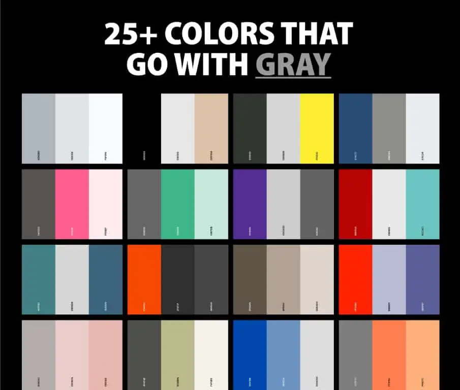
When selecting a color to use against a dark gray background, there are several factors to consider to make sure the color pops and stands out. The main considerations are complementary colors, brightness, and saturation. Using colors that contrast well with gray while also being bright and vivid will help them be most visible and eye-catching.
Using Complementary Colors
One of the best ways to make a color stand out against dark gray is to use colors that are complementary to gray on the color wheel. The complementary colors to gray are orange, yellow, chartreuse green, spring green, cyan, azure blue, violet and magenta. These opposites create strong visual contrast, making them naturally draw the eye when paired with gray.
Of these options, warm colors like orange, yellow and chartreuse green tend to stand out the most. Cooler colors like cyan, violet and magenta also work but may be slightly more subtle. When selecting a complementary color, saturation and brightness are also important factors.
Prioritizing Bright, Saturated Hues
When choosing a color for high contrast with dark gray, prioritize bright, saturated hues. A deeply saturated, vivid version of any complementary color will stand out much more than a dull, desaturated one. For example, a bright crimson red will pop more than a muted burgundy. A neon yellow will grab attention better than a pale lemon shade.
Additionally, darker shades of complementary colors are not ideal because they end up being too similar in lightness to the gray. For maximum contrast, use light to medium tones of your chosen complementary color. If using a darker hue, punch up the saturation to compensate.
| Color | Hue | Saturation | Brightness |
|---|---|---|---|
| Orange | Vivid | High | Medium to light |
| Yellow | Bright | High | Light |
| Chartreuse | Bright | High | Medium to light |
| Cyan | Vivid | High | Medium to light |
This table summarizes the ideal hue, saturation and brightness levels for making complementary colors stand out on gray.
Recommended Color Options
Based on the principles above, here are some specific color choices that will stand out well against a dark gray background:
- Bright orange – A vivid, light to medium orange shade is a great choice. Vermillion, persimmon, or a lighter pumpkin color will all pop.
- Bold yellow – A bright, luminous yellow is another good option. Think sunflower, lemon, or banana yellows.
- Lime green – Vivid lime hues add a lively, energetic vibe. Chartreuse or electric green work well.
- Turquoise – This bluish-green hue really draws the eye. Try a vivid aqua or teal tone.
- Royal blue – Deeper and brighter than navy, royal blue has enough purple undertone to distinctly contrast with gray.
- Fuchsia – This hot pink shade holds its own against gray. Prioritize saturated, brighter fuchsia tones.
- Violet – From lilac to bold purple, a lighter but saturated violet can be striking against dark gray.
Any of these colors will command attention when paired with gray. For extra vibrancy, combine multiple complementary colors such as yellow and purple or orange and cyan.
Avoiding Low Contrast
On the other side of the spectrum, there are certain color approaches that do NOT make colors stand out against gray:
- Using grayish or muted tones – Soft pastels, dusty shades, and colors with low saturation fade into the background instead of contrasting.
- Pairing with darker shades – Deep jewel tones like emerald or navy blue won’t have enough contrast with dark gray.
- Monochromatic schemes – Shades of gray paired with slightly lighter or darker grays lack visual separation.
- Complementary neutrals – Beiges, tans and browns don’t create enough of a color difference from gray.
Keep these poor performers in mind during your selection process. Checking your choices against a gray sample can help avoid low-contrast mishaps.
Contextual Recommendations
While the complementary color options above work across many dark gray contexts, keep these additional guidelines in mind:
- Branding – If using color on gray for a brand, choose signature hues that align with brand guidelines and recognition.
- Print media – CMYK inks have a smaller gamut than digital colors. Rely more on reds, oranges, blues and bright purples.
- Signage – Bolder, lighter colors like yellows, greens and cyans hold up better on gray print and fabric.
- Fashion – For gray clothing and accessories, hot pink, yellow and teal provide fun statement contrast.
- Web design – Onscreen, hyper-saturated neon tones can sometimes overwhelm. Keep saturation moderate.
Testing colors with physical samples is the best way to gauge whether they will pop as intended in the final application.
Using Colors Strategically
Beyond just making colors stand out, also consider how strategically applying them against gray can enhance designs:
- Use brightly colored type, shapes or lines on gray backgrounds to create emphasis.
- Alternate blocks of lighter grays and brighter hues for visual interest.
- Reserve a bold complementary color for primary action buttons on gray interfaces.
- Apply pops of color to vector-based illustrations and logos on gray layouts.
- Highlight key data points and infographic elements by coloring them vibrantly against muted charts and graphs.
Thinking about how, where, and why to apply accent colors purposefully on gray foundations can take designs from flat to striking.
Conclusion
Gray can act as the perfect neutral backdrop for colors to take center stage. Following basic color theory principles of complements and maximizing brightness and saturation are the keys to achieving high contrast. Vivid yellows, greens, oranges, fuchsias and turquoises are fail-safe options that pop. Avoid darker, muted or grayish tones for the most impact. With some strategic applications, a color that stands out well against dark gray can make all the difference in creating engaging, eye-catching visuals.


