Mustard yellow is a bold, bright shade that commands attention. When choosing complimentary colors, it’s important to consider which tones will look striking next to mustard yellow without clashing. Some key factors to consider are color theory, mood and aesthetics, and purpose. Using color theory principles helps identify tried-and-true color pairings. The mood you want to convey and overall aesthetics will dictate what feels cohesive. Lastly, your end goal and application will inform what colors best achieve your aims.
Using Color Theory
Color theory provides guidance on harmonious color combinations based on the color wheel. The traditional color wheel shows primary, secondary, and tertiary colors arranged by hue. Per color theory principles, colors opposite each other on the wheel are complementary colors, while adjacent colors are analogous. Triad colors are three colors equally spaced on the color wheel.
Mustard yellow is a warm, golden yellow shade that falls between primary yellow and tertiary yellow-orange on the color wheel. Its direct complement is a cool purple shade. However, pure purple can look dated or clashing next to the boldness of mustard yellow. Nearby shades like violet, lilac, mauve and lavender are often more pleasing complements. Blue-purples and pink-purples also strike an elegant contrast.
On the analogous side of the wheel, mustard yellow pairs well with other warm earth tones like burnt orange, terra cotta, and brick red. Greens are also analogous complements, ranging from mossy olive greens to vibrant lime greens.
Some examples of triad color combinations that work beautifully with mustard yellow include:
- Mustard yellow, turquoise blue, brick red
- Mustard yellow, sky blue, olive green
- Mustard yellow, lavender, rust orange
While color theory provides a solid starting point, also trust your own eyes and aesthetic preferences when finalizing a palette.
Mood and Aesthetics
The mood and visual appeal you want to achieve will guide which complementary shades look cohesive. Consider where and how you will use the color pairing. Some examples of moods and aesthetics associated with mustard yellow:
- Happy: Pair with bright, sunny colors like orange, yellow, sky blue, and grass green.
- Energetic: Couple with other neon brights like hot pink, lime green, or electric blue.
- Sophisticated: Anchor with muted tones like lavender, slate blue, sage green.
- Retro: Team up with other nostalgic earth tones like brown, olive, burnt orange.
- Moody: Match with richer, darker hues like purple, maroon, navy, or forest green.
- Warm and welcoming: Mix and match with peach, terracotta, yellow, aged wood tones.
Consider whether you want an overall harmony or prefer more striking contrast. Both approaches can yield beautiful results.
Purpose and Function
The intended use for the color pairing also guides the best options. Here are some common goals and suitable complements:
| Purpose | Complementary Colors |
|---|---|
| Kitchen design | Sage green, sky blue, burnt orange, brown |
| Bathroom design | Sea green, sky blue, violet |
| Living room design | Purple, slate blue, olive green, rust orange |
| Bedroom design | Lavender, soft peach, light sage green |
| Office design | Royal blue, gray, burnt orange |
| Restaurant branding | Burnt orange, olive green, red |
| Bakery branding | Sky blue, peach, brown |
When designing anything from interiors to marketing materials, choose the colors that will set the right tone and fulfill the intended spirit. Soft, muted tones create a calm bedroom while energizing brights convey fun for a casual restaurant.
Putting Theory into Practice
While guidelines provide a helpful starting point, the proof is in seeing combinations in action. View swatches, fabric samples, or test colors together through digital mock-ups. Some pairings that look jarring on paper strike the perfect balance in reality. Don’t be afraid to get creative and even bend the “rules” if something feels right to your eye.
When evaluating pairings, check colors in different lighting conditions. Colors can shift in brightness and hue under warm incandescent light versus natural daylight. You want shades that enhance each other across environments.
Here are some real world examples of mustard yellow paired beautifully with complementary hues:
- A mustard sofa against a backdrop of royal purple or slate blue walls
- Mustard and lavender table linens paired together for a wedding
- A mustard yellow door on a brick red Victorian home
- Mustard throw pillows on a sea green couch
- Sage green wall trim alongside mustard walls in a dining room
Test out pairing mustard yellow with a few top contenders. See which delights your eye, suits your project’s aims, and brings out the best in both colors.
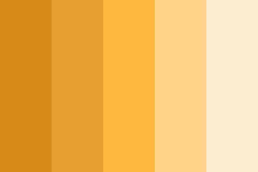
Choosing Your Mustard Yellow Hue
Keep in mind mustard yellow’s shade impacts the right complement. For example, golden mustard with warm orange undertones pairs best with other fiery fall hues. A bright lemony mustard pops against more primary colors. Muted, earthy mustards complement neutrals like gray and brown.
Here’s an overview of common mustard yellow shades and suitable complements:
| Mustard Yellow Hue | Complementary Colors |
|---|---|
| Golden mustard | Burnt orange, olive green, rust red, purple |
| Bright lemony mustard | Royal blue, cherry red, emerald green, pink |
| Dijon mustard | Navy blue, forest green, slate gray, mauve |
| Dark mustard | Charcoal gray, espresso brown, maroon |
The bolder and brighter the mustard, the more vivid its pairing should be to balance it out. Soft muted mustard invites more subtle earth tones and neutrals.
Conclusion
Mustard yellow is a bold, versatile shade that allows lots of creativity in finding the ideal complements. Use color theory as a guide, hone in on an overall mood and aesthetic, and keep your goals in mind. Trust your eyes and test pairings to see what delights you. From striking contrast to harmonious tones, mustard yellow can be mixed and matched with many colors beautifully.
Summary
Here are some key points to remember when choosing colors that complement mustard yellow:
- Consider cool purple shades, warm earth tones, and bright primaries as starting points.
- Let mood, aesthetics, and purpose guide you to harmonious or contrasting pairings.
- Use color theory as a base then trust your own eyes and preferences.
- Test potential combinations and view in different lighting.
- Match the intensity of the mustard shade with bolder or softer complements.
- Have fun mixing and matching to find what excites your eye!
