Colors can have a profound effect on our moods and emotions. Some shades are known to be calming and promote relaxation, while others can increase feelings of anxiety or agitation. Understanding color psychology and how different hues impact us is key for interior designers, artists, and anyone looking to create a peaceful environment.
What is Color Theory?
Color theory is a framework for understanding how colors interact with one another and the psychological effects they can have. It provides guidelines on color mixing and how to create color schemes. Some key elements of color theory include:
– The color wheel – This circular diagram shows the primary, secondary and tertiary colors and how they relate to one another. Complementary colors sit opposite each other, while analogous colors sit side-by-side.
– Color harmony – Combining colors in certain ways creates harmonious or pleasing effects. Common harmonious schemes include complementary, analogous and triadic.
– Color context – How we perceive a color can change drastically depending on what colors surround it. This is known as simultaneous contrast.
– Color symbolism – Colors are often associated with certain meanings or emotions. For example, red can symbolize love, passion or anger. Blue often represents calmness or sadness.
Psychology of Color
The psychology of color examines how different hues affect us mentally and emotionally. It is closely linked to color theory. Some key findings on color psychology include:
– Warm colors (red, orange, yellow) tend to arouse or stimulate. Cool colors (blue, green, purple) are typically more relaxing.
– Bright, saturated colors are energetic and vivid but can be overstimulating. Soft, muted shades are gentler and more subtle.
– Light colors tend to feel airier and more spacious. Darker shades can feel heavier and intimate.
– Culture and personal experiences also inform our psychological associations with color. For example, white is linked with purity in Western cultures while representing death in some Asian cultures.
Most Calming Colors
When looking for hues that promote tranquility and relaxation, turn to colors associated with nature, water and the sky. Here are some of the most calming colors:
Blues
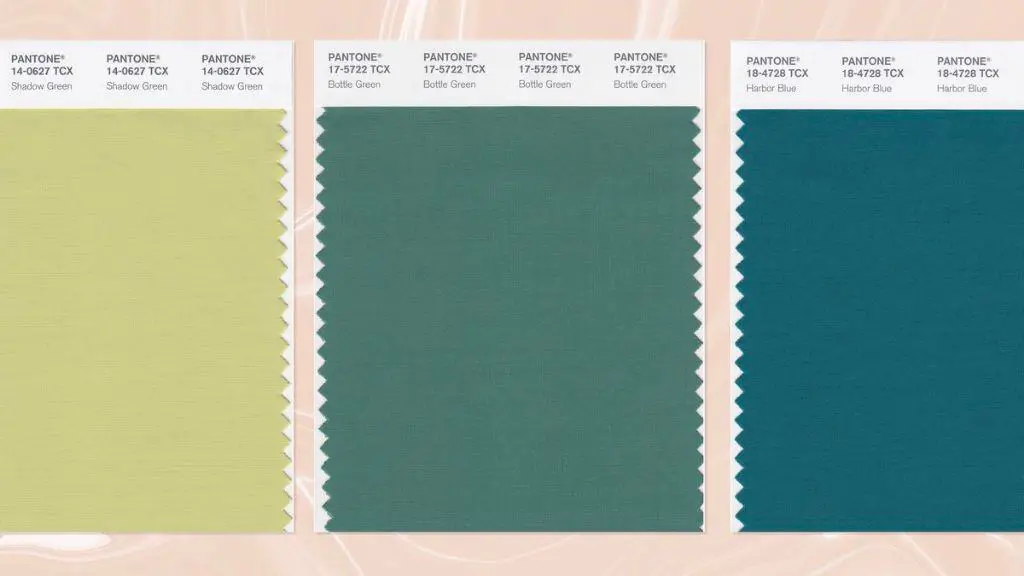
Shades like sky blue, azure and teal conjure up images of streams, lakes and the ocean. The cool undertones are inherently peaceful and soothing. Lighter tints feel more relaxing, while darker shades can be mood boosting.
Greens
Green evokes thoughts of lush grass, forests and vegetation. It symbolizes renewal and harmony. Green is considered one of the most balanced and restful colors. Soft sage greens are especially tranquil.
Violets/Lavenders
With undertones of blue, violets and lavenders promote relaxation and self-reflection. They have long been associated with royalty and luxury too. Pale lilacs or a hint of purple can establish a sense of calm.
Pinks
While bright pinks are stimulating, softer dusty and blush pinks have a gentle, comforting effect. They create a sense of warmth and sweetness. Pink is also linked to romance and femininity.
Neutrals
Whites, creams, grays and other muted neutrals promote feelings of peace due to their incredibly soft hues. They make serene backdrops and are easy to layer with other calming colors.
| Color | Psychological Effects |
|---|---|
| Blues | Peaceful, tranquil, soothing, relaxed |
| Greens | Balanced, refreshed, renewal, harmony |
| Violets/Lavenders | Relaxation, self-reflection, spirituality |
| Pinks | Gentle, comforting, warmth |
| Neutrals | Calmness, softness, serenity |
Using Calming Colors in Design
Incorporating relaxing hues into interior design, products and visuals can have major benefits. Here are some tips for using calming colors effectively:
– Paint walls blue, green or neutral to establish a peaceful backdrop. Accent with violets, pinks and metallics for extra tranquility.
– Choose calming colors for large surfaces like floors, walls and furniture. Use sparingly for accents.
– Incorporate textiles like pillows, throws and rugs in serene shades. This adds comfort and coziness.
– Use paler, softer versions of colors for a more relaxing effect. Deep, bold shades can become overwhelming.
– Add calming colors to bedrooms, spas, living rooms and offices to promote restfulness and rejuvenation.
– Coordinate colors with purpose. For example, use blue in a medical office to evoke trust and dependability.
– Establish contrast between stimulating warm hues and peaceful cool shades. This creates visual interest and balance.
Health Benefits of Calming Colors
Surrounding yourself with relaxing colors can provide some surprising health perks including:
– Lowered blood pressure and heart rate
– Reduced anxiety and improved mood
– Increased concentration and focus
– Better sleep quality
– Boosted creativity and productivity
– Enhanced feelings of happiness and optimism
– Accelerated healing and recovery
Calming colors are especially helpful for high-stress spaces like hospitals, dental or doctors offices, schools and more. They can also boost relaxation in homes.
