When designing or redecorating a kitchen, choosing the right colour scheme is an important decision. The colours you choose for your kitchen walls, cabinetry, countertops, flooring and decor impact the overall aesthetic, functionality and mood of the space. Neutral colours are popular options for many kitchen designs, as they provide a versatile backdrop that works with many styles. But with so many neutral shades to choose from, how do you select the right neutral palette for your kitchen? Here are some of the top considerations when evaluating neutral colour choices for your kitchen.
Benefits of Neutral Kitchen Colours
There are several reasons why neutral colours are common choices for kitchen designs:
– Neutrals create a calming, soothing environment. Soft beiges, warm taupes, light grays and classic whites help the kitchen feel serene and relaxed. This can make it a more welcoming space to cook, dine and spend time in.
– Neutral palettes act as a subtle backdrop that puts the focus on kitchen features, furnishings and decor. Bolder accent colours and materials stand out beautifully against neutral walls and cabinetry.
– Neutral colours make the kitchen appear larger and brighter. Light to medium neutrals reflect more light around the room, which can help small kitchens feel more open and airy.
– Neutral kitchens have a timeless look. While colour trends come and go, neutral palettes have an enduring, classic aesthetic. This makes neutral kitchens easier to maintain over time.
– Neutral colours are highly versatile. They work with many styles from traditional to contemporary. Neutral kitchens also coordinate well with many accent colours, making it simple to give the space a refreshed look just by changing out decor and accessories.
Factors to Consider
When evaluating different neutral shades for your kitchen, here are some factors to take into account:
– Existing Elements: Consider existing elements you want to work with, such as flooring or countertops, and choose neutrals that complement them. Neutrals in the same tone or intensity will create a cohesive look.
– Lighting: Lighter neutrals work best in kitchens with limited natural light, as they reflect and bounce light around the room. Use darker or warmer neutrals in well-lit kitchens.
– Mood: Do you want a soothing, relaxed mood or an elegant, sophisticated look? Cool grays and beiges are calming, while antique whites and greige shades (a gray-beige hybrid) create a more refined aesthetic.
– Style: Traditional kitchens look beautiful in off-whites, beiges and warm grays, while more contemporary spaces suit cooler grays.
– Functionality: For high-traffic areas around entries, cooking zones and children’s spaces, consider durable neutrals like stone grays. Save more delicate hues for low-traffic areas.
– Accents: What accent colours and materials do you want to incorporate? Be sure your neutrals complement planned accents like tiles, granite or painted cabinets.
Popular Neutral Kitchen Colours
Here is an overview of some of the most popular neutral colours for kitchens:
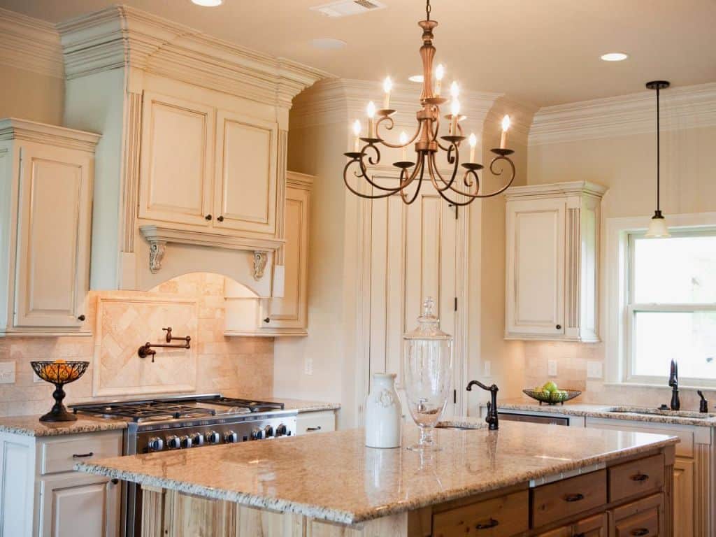
Whites
– Bright White: Crisp and clean, great for modern spaces
– Antique White: Warm and traditional, works with many styles
– Buttery/Oyster White: Softest white with slight yellow/grey undertone
– Alabaster: Silvery-toned white, provides an airy feel
Cream & Beige Tones
– Cream: Classic and versatile, easy to decorate with
– Beige: Safe, simple neutral that mixes well with other hues
– Greige: Hybrid of grey and beige, elegant and upscale
– Biscuit: Yellowy soft beige, feels cozy and beachy
Browns
– Light brown: Warm, inviting version of basic brown
– Taupe: Cool mushroomy brown with a modern edge
– Mocha: Richer, darker brown with gray undertones
Grays
– Light gray: Airy, bright neutral with relaxed vibe
– Medium gray: Balanced, versatile shade between black and white
– Charcoal gray: Deeper gray with sophisticated look
Best Neutral Combinations
Pairing two neutral colours together creates pleasant, harmonious kitchen palettes. Here are some recommended neutral colour combinations:
| Colour 1 | Colour 2 |
|---|---|
| White | Light gray |
| Antique white | Taupe |
| Alabaster | Charcoal gray |
| Cream | Beige |
| Oyster white | Light brown |
Using one neutral for upper cabinets and another for lowers is an appealing look. Or just vary textures – glossy uppers in white with matte gray lowers, for example.
Creative Combinations
Moving beyond basic two-tone combinations, consider layering multiple neutral shades and materials for added depth and interest:
– White upper cabinets + medium wood lowers + pale stone backsplash
– Creamy cabinets + brown granite countertops + sandy travertine floor
– Matte navy blue island + light oak base cabinets + gray quartz counters
Don’t be afraid to get creative mixing multiple neutral colours and textures to craft your own signature kitchen palette.
Accent Colours
While neutrals create a flexible core palette, well-chosen accent colours can inject personality and flair. Here are accent shades that pop beautifully against neutral kitchen backdrops:
– Sapphire blue
– Emerald green
– Sunflower yellow
– Coral pink
– Eggplant purple
– Brick red
Add accents with smaller appliances, kitchenware, window treatments, barstools or glass pendant lights. A little colour goes a long way to personalize a neutral kitchen.
Paint, Tile & Material Options
Beyond just colour, also evaluate sheen, texture and materiality when selecting neutrals. A few ideas:
Cabinet & Wall Paint
– Matte or eggshell finish for low-traffic walls
– Satin sheen for cabinets and trim
– Semi-gloss on high-traffic areas that need cleaning
Countertops
– White, gray or beige engineered quartz
– Marble, soapstone or concrete for organic texture
– Laminate in solid neutrals or neutral patterns
Backsplash
– Subway tile with neutral grout
– Stone or ceramic mosaic tiles
– Metal or wood plank tiles
Flooring
– Hardwood in natural oak or walnut
– Stone tile in travertine or slate
– Luxury vinyl plank in concrete or wood looks
Mixing natural and synthetic materials like wood cabinets + quartz counters + vinyl plank floors creates visual interest and depth.
Use Neutrals to Define Zones
In open concept kitchens, clever use of neutrals can help define different functional zones, such as:
– Light beige walls in cooking zone, dark gray island base
– White perimeter counters, black center prep zone island
– Gray floors in dining area, whitewashed wood in kitchen
This technique helps the expansive space feel organized and segmented, while maintaining an open flow.
Tips for Small Kitchens
For compact kitchens, stay bright and airy. A few tips:
– Monochromatic all-white palette
– Light countertops + pale backsplash + white cabinets
– High-gloss white uppers for reflective surface
– Unfilled translucent glass cabinet doors
As a general rule with small kitchens, limit the number of neutrals used. Stick to two or three tones at most for a seamless look.
Conclusion
Selecting appealing, on-trend neutral colours for your kitchen remodel or redesign is key to achieving the aesthetic and functionality you desire. Assess existing elements, lighting, mood, style and planned accents to guide your decisions. Layer in multiple neutrals with varying textures and materials to create depth. Boost with lively accent colours like deep blues, jewel-toned greens or sunny yellows. With the right neutral palette and pops of colour, your kitchen will always feel fresh, yet comfortably timeless.
