Brown is an earthy, neutral color that can have warm or cool undertones. While brown may seem like a basic color, there are actually many different shades and hues of brown that can be created by mixing other colors.
Primary Colors
In art and color theory, the primary colors are red, blue and yellow. These are called primary colors because they cannot be created by mixing other colors, and all other colors are derived from these 3 hues. To make secondary colors, you combine two primary colors.
For example:
- Red + Blue = Purple
- Red + Yellow = Orange
- Blue + Yellow = Green
So by mixing combinations of the primary colors red, blue and yellow, you can create virtually any color including shades of brown.
Creating Brown from Primary Colors
When it comes to mixing colors to make brown, there are a few common combinations you can use:
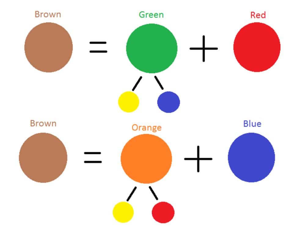
- Red + Green = Brown
- Yellow + Purple = Brown
- Orange + Blue = Brown
Since green, purple and orange are all secondary colors created from the primary colors, these color combinations show that you need all 3 primary colors (red, blue and yellow) to make the color brown.
Complementary Colors
Another way to look at mixing colors to create brown is using complementary colors. Complementary colors are any two colors opposite each other on the color wheel. Some examples of complementary color pairs are:
- Red & Green
- Blue & Orange
- Yellow & Purple
When you mix complementary colors, they neutralize each other to create more muted, earthy shades. This makes them ideal for mixing browns. Using complementary versions of the primary colors is a go-to technique for painting and shading brown tones.
Tertiary Colors
There is another group of colors derived from the primary and secondary colors, known as tertiary colors. These are made by mixing a primary color with a secondary color adjacent to it on the color wheel. For example:
- Red + Purple = Red-Purple
- Yellow + Green = Yellow-Green
- Blue + Green = Blue-Green
These tertiary colors have a more complex, nuanced appearance than primary and secondary colors. Mixing adjacent tertiary colors together is another great way to produce natural browns and earth tones.
Color Mixing Ratios
So while the primary colors red, blue and yellow are needed to ultimately create brown, the specific ratio you use makes a big difference in the exact brown tone you produce.
Here are some examples of mixing ratios to create different shades of brown:
| Color 1 | Color 2 | Ratio | Resulting Brown |
|---|---|---|---|
| Orange | Blue | 3:1 | Yellow-brown |
| Red | Green | 1:1 | Rusty brown |
| Purple | Yellow | 2:1 | Taupe |
| Red | Blue | 1:2 | Dark brown |
As you can see, mixing more warm colors like orange and yellow will create lighter or more golden browns. Using more cool colors like blue and purple results in darker, deeper browns approaching black.
Tinting Browns
In addition to mixing colors to create brown hues, you can also start with a premixed brown and tint it to alter the shade. Adding white will make the brown lighter, creating beige, tan or ecru colors. Adding black will darken and mute the brown into charcoal or taupe shades.
The amount of white or black paint you add will determine how light or dark the finished shade becomes. Start with a little and gradually increase the white/black amount to reach your desired tone.
Shading Browns
When working with brown paint, you can also modify the color by adding new colors directly rather than black/white. For example:
- Add red – Deepens brown into red-browns or chestnut
- Add blue – Cools down brown into gray-browns
- Add yellow – Warms up brown into golden browns
- Add green – Olive, mossy shades
- Add purple – Muted plum browns
This type of tinting allows even greater control over the exact hue and feel of the brown color.
Lighting Effects
The way brown changes in different lighting is also an important factor when working with the color. Here are some lighting effects to keep in mind:
- Full sunlight – Browns become warmer and more yellow/orange
- Cloudy day – Browns look grayer and cooler
- Incandescent light – Browns take on a reddish, golden cast
- Fluorescent light – Makes browns look dull and flat
So the lighting source itself will impact the appearance of brown. These effects are good to keep in mind whether mixing paints to match a sample or observing browns in nature.
Common Browns in Nature
Brown is one of the most abundant colors in nature. Here are some of the most recognizable brown shades found outdoors:
- Tree bark – Varies from light tan to almost black
- Dirt – Ranges from yellowish brown to deep reddish brown
- Rocks/mountains – Grayish browns to golden brown depending on minerals
- Animal fur – Brown, beige, chestnut, mink, chocolate
- Autumn leaves – Burnt umber and orange brown hues
Browns help provide a feeling of earthiness, nature and organic objects. Even within a category like tree bark, there may be dozens of distinct shades ranging from brown to gray.
Common Brown Pigments
When working with paints, pigments are used to produce different colors. Here are some of the most common brown pigments used in painting:
- Raw umber – Yellowish golden brown
- Burnt umber – Darker reddish brown
- Raw sienna – Yellow-orange brown
- Burnt sienna – Opaque reddish brown
- Van Dyke brown – Rich transparent dark brown
- Coffee – Semi-transparent medium brown
These allow artists to capture the myriad variations of brown they observe in nature. Other more generic brown pigments include mars brown, dark oxide and light red oxide.
Textile Browns
In the world of textiles and fashion, brown is an important neutral color. Some shades have very specific names based on their appearance:
- Khaki – Light yellowish tan
- Beige – Light yellowish brown
- Buff – Yellowish brown
- Ochre – Golden yellow brown
- Russet – Dark reddish brown
- Taupe – Dark grayish brown
- Mocha – Grayish brown with red undertone
Browns like khaki and beige are popular for clothing, while russet and ochre work well for fall fashion. Distinct brown shades can be achieved using natural dyes as well as synthetic fabric dyes.
Psychology of Brown
Brown has several associations in design, decorating and color psychology. Here are some of the impressions given by different shades of brown:
- Light browns – Wholesome, approachable, warmth
- Medium browns – Reliability, resilience, earthiness
- Dark browns – Seriousness, formality, tradition
- Reddish browns – Vintage, nostalgia, autumn
- Olive browns – Naturalness, neutrality, military
So brown can convey anything from coziness to ruggedness depending on the exact shade. It promotes security and substance without seeming showy or high-maintenance.
Brown Color Schemes
Some classic color pairings that work well with different shades of brown include:
- Khaki and navy blue
- Beige and sage green
- Camel and burgundy
- Mocha and turquoise
- Chocolate and pink
- Coffee and light blue
Brown helps anchor these paler accent colors. It also works as a neutral background that lets bolder orange, teal or violet hues stand out. Grouping different textures of browns can create an earthy, rustic look.
Uses of Brown
Some of the most popular uses of brown shades include:
- Paint – Browns for shading and coloring wood, earth, animals
- Clothing – Khaki, olive, tan, beige and neutral browns
- Furniture – Classic brown leather sofas or wood pieces
- Accessories – Belts, shoes, handbags, watches in brown leather
- Nature – Trees, rocks, dirt, fur, fallen leaves in autumn
- Food – Coffee, chocolate, maple, spices, nuts, baked goods
Brown conveys familiarity, comfort and craftsmanship across many sectors. It feels casual, accessible and down-to-earth.
Conclusion
Brown is an extremely versatile color with many shades created by mixing its primary color components – red, yellow and blue. Adjusting the ratios and adding tinting colors allows limitless variations from beige to mahogany. Brown shades have natural, cozy and approachable connotations. They work in both warm and cool color schemes for designs and decor. While brown may seem simple, its abundance in nature and everyday life gives it a special place in color theory and usage.
