Both maroon and burgundy are deep, dark shades of red that sometimes look similar. However, there are distinct differences between these two classic colors that help set them apart. Understanding the nuances between maroon and burgundy can help you determine which is more purple.
Defining Maroon
Maroon is a very deep, dark red color that has a brownish-red hue. It sits between red and brown on the color wheel and is considered a tertiary color.
Some key facts about maroon:
- The first recorded use of “maroon” as a color name in English was in 1789.
- Maroon gets its name from the French word “marron” meaning chestnut.
- Maroon is created by adding brown to red.
- The HEX code for maroon is #800000.
- Maroon symbolizes power, courage, and strength.
When thinking about maroon, imagine the color of a chestnut or a deep red wine. It’s an earthy, brownish crimson shade.
Defining Burgundy
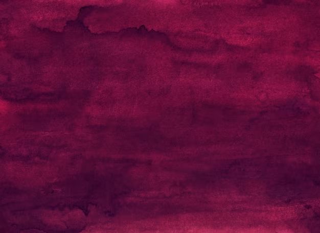
Burgundy is also a deep, dark red shade that has purplish undertones. It’s considered a tertiary color sitting between purple and red on the color wheel.
Here are some key facts about burgundy:
- Burgundy first became popular as a color name in the 17th century. It was named after the Burgundy wine from the Burgundy region of France.
- The HEX code for burgundy is #800020.
- Burgundy is created by mixing red and purple.
- It represents elegance, refined taste, royalty, and luxury.
Think of the deep red color of red wine from Burgundy when envisioning burgundy. It’s a rich, intense reddish purple.
Comparing Maroon and Burgundy
Now that we’ve defined maroon and burgundy separately, let’s directly compare the two colors:
| Maroon | Burgundy |
|---|---|
| Dark brownish-red | Dark purplish-red |
| Hex code #800000 | Hex code #800020 |
| No traces of purple | Has subtle purple tones |
| Closer to red-brown | Closer to red-purple |
| Brown added to red | Purple added to red |
| Earthy, burnt shade | Royal, elegant shade |
This comparison clearly highlights the main difference between maroon and burgundy: maroon has no traces of purple, while burgundy has subtle purple tones.
Is Maroon More Purple than Burgundy?
Based on the definitions and comparisons above, it’s evident that burgundy contains more purple than maroon.
Burgundy sits between purple and red on the color wheel. It’s created by mixing red with purple. You can see subtle purple tones and hues in true burgundy shades.
On the other hand, maroon has no traces of purple at all. It sits firmly between red and brown on the color wheel. Maroon is created by adding brown to red, giving it earthy, brownish undertones instead of purple ones.
For these reasons, burgundy has a distinctly more purple appearance than maroon in direct comparison. Burgundy could be described as a “reddish purple” whereas maroon is simply a “dark red.”
When Maroon and Burgundy May Seem Similar
Despite burgundy containing more purple undertones, maroon and burgundy can still appear somewhat similar in certain contexts.
In very dark lighting conditions, the subtle purple tones of burgundy may not be detectable, causing it to resemble a dark maroon shade. Additionally, viewing maroon and burgundy on a small screen or from a distance can make the colors appear more alike.
Using maroon and burgundy together in a similar context, like in an outfit or interior design scheme, can also blend them together visually. The eye will focus on their shared deep red characteristics rather than the subtle purple differences of burgundy.
Lastly, variations in dyeing and computer rendering can impact how purple burgundy truly looks. A “dull” burgundy may lose its purple sheen, seeming more maroon-like.
Tips for Telling Maroon and Burgundy Apart
To avoid maroon and burgundy confusion, here are some tips for telling them apart:
- Examine colors in normal daylight conditions. Subtle color differences are harder to distinguish in low light.
- Look closely to spot purple undertones in burgundy.
- Burgundy often appears more elegant and regal.
- Maroon typically looks earthier and more rugged.
- Compare to swatches with known HEX codes.
- View colors isolated from one another, not together.
- Seek out true, high quality versions of each color.
- Study how color mixes were achieved – burgundy mixes purple and red.
Uses for Maroon vs. Burgundy
Understanding if a shade is definitely maroon or burgundy can be important depending on how the color will be used. Here are some common uses for each:
Maroon Uses:
- School, university colors
- Sports team colors
- Rich, warm accent color
- Classic fall/winter color
Burgundy Uses:
- Luxury packaging or branding
- Formal event décor
- Royal color references
- Sophisticated accent color
Maroon’s rugged, earthy look suits casual, masculine settings like academia and sports. Burgundy’s refined elegance works for upscale events, packaging, and decor.
Comparison in Design and Fashion
In design and fashion, burgundy tends to be considered more versatile and attractive than maroon. However, maroon can provide an earthy, vintage look in certain contexts.
Burgundy’s mix of red and purple gives it a sense of depth and richness that flat maroon lacks. Burgundy also harmonizes well with more colors from beiges to blues. Maroon has a smaller range of ideal color pairings.
In fashion, burgundy provides a more feminine, flattering option for clothing and accessories. Maroon skews more masculine and casual. However, maroon has seen resurgences for retro and 1990s inspired looks.
Comparison in Marketing
Both maroon and burgundy can convey certain impressions in marketing and branding applications:
Maroon Branding:
- Academic tradition
- Strength and resilience
- Simple, down-to-earth
Burgundy Branding:
- Luxury and sophistication
- Refined taste
- Femininity and elegance
Maroon leans more masculine, casual, and traditional. Burgundy skews feminine, upscale, and refined. But both communicate passion and depth.
Using Maroon and Burgundy Together
Because maroon and burgundy are so close in hue, you need to be careful when using them together. It’s easy for them to start looking too similar.
Limit maroon and burgundy combinations to accent details, like maroon shoes with a burgundy handbag. Vary textures and styles to differentiate them more. For example, matte maroon velvet with glossy burgundy satin.
If you use maroon and burgundy equally, choose sufficiently different shades and add in separating neutrals. You want each color to retain its distinct character for optimal contrast.
Conclusion
In summary, burgundy contains subtle yet visible purple undertones while maroon does not have any traces of purple. Burgundy sits between red and purple on the color wheel; maroon falls between red and brown. So burgundy is decidedly more purple-toned than maroon.
However, in some lighting conditions, viewing contexts, or when used together, maroon and burgundy can appear quite similar. Look closely for purple hues and use color mixing facts to properly differentiate these two deep red shades.
Understanding the relationship between maroon and burgundy helps you pick the right shade for your specific design, fashion, or branding needs. While similar, maroon and burgundy evoke slightly different looks and impressions.
