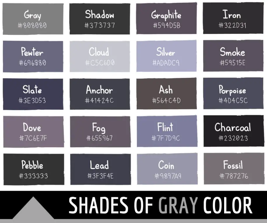
Grey is an interesting color that can often be seen as having qualities of both warm and cool tones depending on the context. When discussing color theory, grey is considered a neutral color, meaning it does not lean specifically warm or cool. However, different shades of grey can take on slightly different temperature associations based on how they are used. Understanding the nuances of how grey relates to color temperature can help creatives, designers, and artists make informed decisions when including it in their work.
The basics of color temperature
Before diving into specifics on grey, it helps to understand the basic principles of color temperature. Colors are often categorized by how warm or cool they appear. Warm colors like red, orange, and yellow remind us of things like fire, sunlight, and heat. Cool colors like blue, green, and purple are more associated with things like water, ice, and the night sky.
Temperature in color is relative, so a color can seem warmer or cooler depending on what it is being compared to. Context also matters, as surrounding colors impact how we perceive a specific hue. But in general:
– Warm colors feel energizing and vivid
– Cool colors feel calming and soothing
Color temperature helps convey mood. Warm palettes feel fun and inviting, cool palettes feel reserved and elegant. When planning color schemes, artists take advantage of temperature associations to create the right ambiance.
How neutral colors relate to temperature
Neutral colors like black, white, brown, beige, and grey sit in the middle of the color wheel between the warm and cool sides. They are not distinctly warm or cool on their own. However, neutrals take on the temperature traits of colors around them through a phenomenon known as temperature bias.
Put a neutral grey next to a bright red, and it will shift warmer. Put that same grey next to a seafoam green, and it will take on a cooler bias. This ability to pivot between warm and cool is what makes neutrals like grey so versatile.
Factors that influence grey’s temperature
Specifically within the range of grey tones, there are a few factors that cause certain shades to read warmer or cooler:
Undertones
– Greys with red, pink, or orange undertones appear warmer
– Greys with blue, green, or purple undertones appear cooler
Lightness/darkness
– Very light greys seem crisp and cool
– Very dark charcoal greys seem cozy and warm
– Mid-range greys can go either way depending on context
Saturation
– Desaturated, muted greys look more cool
– Greys with a hint of color saturation look warm
Material association
– Warm woods and stones make greys feel earthier
– Cool metals and stones make greys feel sleeker
Examples of warm grey colors
Here are some examples of grey tones that typically read as warm:
Greige
Greige refers to grey with a beige influence. The subtle warmth from the beige base gives this grey a cozy, inviting vibe.
Mushroom or taupe
Recalling the earthy tones of mushrooms and soil, these soft greys have a natural warmth.
Dove grey
This very soft, pale grey gets its name from the grayish tan color of doves. The subtly pinkish undertone reads as delicate and warm.
| Greige | |
| Mushroom | |
| Dove grey |
Examples of cool grey colors
Here are some examples of grey tones that typically read as cool:
Platinum
This pale, lightly desaturated grey mimics the sleek look of polished platinum metal.
Silver grey
Recalling the appearance of elemental silver, this grey has an icy, gleaming vibe.
Charcoal grey
While very dark greys can sometimes read warm, charcoal grey is a straight dark grey with no warm undertones. The depth creates a sophisticated coolness.
| Platinum | |
| Silver grey | |
| Charcoal grey |
Using warm greys vs cool greys
Whether a warm or cool grey is preferable depends on the overall color scheme and desired mood:
Warm greys…
– Add coziness and warmth to a palette
– Soften harsher or brighter colors
– Convey comfort, hospitality, earthiness
Cool greys…
– Add sophistication and sleekness
– Make palettes feel more unifying and harmonious
– Convey modernity, futurism, professionalism
A warm grey sofa in a living room provides a relaxed vibe, while cool grey business cards feel authoritative and refined. Keep these contextual associations in mind when using grey.
Grey as a neutral base
One of the most powerful features of grey is its ability to work as a neutral base that colors can build on top of. Because grey can pick up warm and cool undertones from surrounding hues, it provides the perfect starting point to layer more colors.
For example, an artist can start with a medium grey canvas. Adding orange and yellow tones will cause the grey to feel warm, while blue and green layers will steer it cooler. This flexibility makes grey an ideal foundation for colorful art.
In interior design, a grey accent wall or large furniture piece allows pops of color to really stand out. The grey adapts to the temperature of decorative pillows, art pieces, and other finishes layered into the space.
Make grey warm or cool with placement
As a neutral, grey’s temperature can be manipulated by placement within a composition. Surrounding it with other hues will rub off warm or cool associations.
Some examples of using placement to control grey’s tone:
– Set a grey vase on an orange shelf and it will read warmer
– Frame a grey print with purple matboard for a cooler effect
– Paint a grey stripe on a yellow wall and it will blend into the warm palette
– Add grey text over a mint green graphic and it will skew cooler
Think about the whole picture when using shades of grey. Its neighbors on the color wheel have a big impact.
Use contrasting greys to add visual interest
Layering contrasting shades of grey can create visual dynamism and depth. The interplay between light and dark, saturated and muted, warm and cool greys keeps a palette lively, even when color is limited.
Some examples:
– A medium grey sofa paired with dark grey throw pillows
– Cool platinum grey walls with warm grey trim and floors
– A greyscale abstract painting with multiple grey tones
Monochromatic does not have to mean monotonous when working with skillful combinations of greys. The neutral color offers endless versatility.
Conclusion
While grey exists somewhere in the middle as a true neutral color, different shades can pick up subtle warm or cool qualities based on factors like undertones, lightness, and surrounding colors. Warm greys work beautifully for creating comfortable, earthy, inviting environments. Cool greys excel at adding sophistication, modernity, and sleekness. Ultimately grey’s temperature is very flexible depending on how it is used in a given application. This mutability makes it one of the most useful colors for designers and artists seeking both neutrality and nuance in their palettes.
