Blue is one of the most popular colors for interior design. With its versatile shades that range from pale sky blue to deep navy, blue can create a variety of moods and atmospheres in a room. But is blue truly an optimal color choice for interior spaces? Here we’ll examine the pros and cons of using blue for interior design.
The Pros of Using Blue
There are several benefits to choosing blue as an interior design color:
Tranquil and Calming
Lighter shades of blue evoke feelings of relaxation and tranquility. Studies have found that blue has a positive impact on mental clarity and focus. Pale blue is recommended for rooms like bedrooms and home offices where people want to feel calm and focused.
Clean and Refreshing
Crisp shades of blue are associated with water and sky, creating a fresh open feeling. Blue is a popular color for bathrooms, kitchens, and other interior spaces where people want an uplifting clean atmosphere.
Adaptable and Versatile
With its wide spectrum from light to dark, blue is extremely versatile. Different shades of blue can set different moods, from soothing to dramatic. This adaptability makes blue a practical choice that can work in many interior design contexts.
The Cons of Using Blue
However, there are also some potential downsides to be aware of when using blue for interior design:
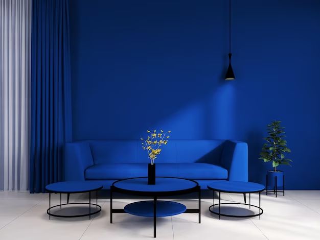
Can Feel Cold
While pale blue can seem tranquil, darker shades like navy or cobalt may read as cold or uninviting. Rooms painted primarily in deep blues may feel stark and gloomy.
Appetite Suppressant
Blue can have an appetite suppressing effect, so it may not be the best choice for dining rooms where food is consumed. Blue dining spaces may discourage people from eating.
Not Suited to All Ages
While adults may appreciate blue’s soothing qualities, young children often prefer warmer, bolder colors. Blue bedrooms or playrooms may not hold a small child’s interest.
Best Uses of Blue in Interior Design
Despite its potential drawbacks, blue can work beautifully in interior spaces when used strategically. Here are some of the top uses for different shades of blue in interior design:
| Shade of Blue | Best Interior Uses |
|---|---|
| Pale Blue | Bedrooms, living rooms, home offices, bathrooms |
| Sky Blue | Kitchens, bathrooms, laundry rooms, boy’s bedrooms |
| Navy Blue | Dens, libraries, dining rooms, home theaters |
| Royal Blue | Entryways, hallways, accent walls |
Pale Blue
Soft, pale blue is ideal for bedrooms, living spaces, and bathrooms where a gentle, tranquil atmosphere is desired. It promotes relaxation and serenity.
Sky Blue
The light, ethereal quality of sky blue works well in kitchens, bathrooms, and functional home spaces where a clean, open feel is appreciated. It’s also cheerful for a boy’s bedroom.
Navy Blue
In deep dramatic shades, blue is well-suited to dining rooms, dens, libraries, and home theaters where a cozy, enveloping feel is welcomed. Navy blue creates an intimate, cocooning effect.
Royal Blue
Vibrant royal blue makes a bold accent color in entryways, hallways, and on accent walls. It commands attention while still retaining blue’s sense of tranquility.
Tips for Decorating With Blue
If you’re sold on using blue in your interior design scheme, here are some tips to decorate with blue effectively:
Combine Blue with Warm Colors
Balance out blue’s cooler undertones by pairing it with warm hues like peach, yellow, or terracotta. This prevents the space from feeling too icy.
Use Multiple Shades of Blue
Incorporate both light and dark blue tones in your design to create visual depth and interest. Contrast a pale blue wall with navy blue upholstery.
Add Textures and Patterns
Layer in textiles with blue hues and patterns. Blue and white stripes or an ikat print blue rug will keep the design lively and multidimensional.
Paint Ceilings a Lighter Shade
Painting the ceiling a lighter blue can make a blue room feel more expansive and airy. Deeper blue on walls with pale blue overhead is a winning combo.
Display Blue and White Ceramics
The classic pairing of blue and white chinaware, platters, vases, or other ceramics really pops against a blue background. Display these as accents.
Conclusion
Blue is a versatile color with many applications in interior design. While it has some potential drawbacks, strategic use of the right blue hues and proper color pairings can overcome these issues. From serene bedrooms to dramatic dining rooms, blue is a timeless, adaptable choice that brings beauty and tranquility to interior spaces. With mindful design choices, blue’s benefits can be maximized for an interior that soothes, refreshes, and inspires.
