Purple and black are both popular colors that can look great together in fashion, interior design, and art. However, sometimes purple can appear too vibrant next to black, and you may want to mute or darken the purple to make it closer to black in appearance. There are a few simple techniques you can use to make purple look darker and closer to black when paired together.
Add Brown or Grey
One of the easiest ways to make purple look darker is by adding a neutral color like brown or grey. Adding just a touch of brown or grey pigment to purple paint, dye, icing, or any other purple medium will dull down the brightness and create a deeper, darker purple shade.
For example, mixing a small amount of brown, grey, or black paint into purple paint before applying it will quickly darken the purple. When dyeing fabric, you can also add a tiny bit of black or grey dye to the purple dye bath. Just a drop or two is usually enough to create a noticeable darkening effect.
When working with icing or frosting, adding a tiny dab of brown or black food coloring will mute bright purple down to a darker, more black-toned shade. Subtlety is key when darkening purple, as you don’t want to add too much brown or grey, otherwise you’ll end up with a muddy color.
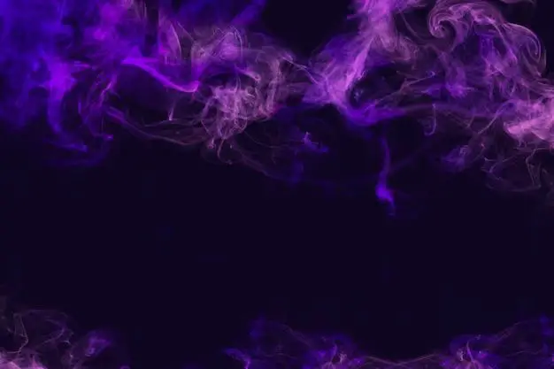
Blend with Black
Another easy way to make purple look darker and closer to black is by physically blending it with black paint, dye, icing, or ink. Mixing even ratios of black and purple will create a dark, smokey purple shade.
For example, mix equal parts black and purple paint before painting. Or add equal amounts of black dye and purple dye to the dye bath when dyeing fabric. Play around with different mixing ratios to achieve different shades of dark purple.
When ink blending, slowly add small amounts of black ink to purple ink until you reach your desired darker shade. The same technique works for blending black and purple icing – just mix together until you’re happy with the darker purple tone.
Layer with Black
Rather than blending purple and black together, you can also layer them to make the purple appear darker. Using black as a background will make overlaying shades of purple pop as deeper, almost black-looking shades.
For example, paint a layer of black paint first, then paint purple in shapes, patterns, or designs on top. The purple will stand out as being very dark against the black background. This works for any medium – dye black fabric first, then dye purple designs on top; stamp black ink first, then purple ink on top; etc.
You can also place a semi-transparent layer of purple fabric, plastic, or colored gel over a black background. The transparency allows the black to show through, darkening and deepening the purple color. This technique is common in theatre lighting.
Add Shadows/Low Lighting
Using shadows and low lighting is an easy way to make purple look darker and closer to black. Position purple objects or materials in a shadowed area away from direct lighting. The lack of light causes the purple to appear several shades darker than normal.
You can create shadow effects by:
– Hanging sheer black curtains to block and filter natural lighting
– Using low watt light bulbs
– Painting a black wall behind purple décor/clothing
– Shooting photos in shadows or low evening light
Candlelight, small table lamps, and low watt bulbs (25 watts or under) will cast flattering shadows that can make purple look rich, dimensional, and almost black. Work with the existing light in a room to find where purple looks the darkest.
Go Darker with Dye/Pigment
When working with paint, dye, ink, or pigmented icing/frosting, simply choosing a darker purple shade will instantly make it closer to black. Look for deep purple shades with “midnight”, “black”, or “plum” in the name.
For example, choose a dark purple fabric dye instead of a vibrant purple. Or select a rich “midnight purple” cake decorating color rather than “grape purple”. Darker purple shades have more blue undertones, which gives them greater depth.
You can also add a small amount of blue dye/pigment to regular purple to create a darker, cooler undertone purple that mimics black’s depth. The more saturated the color, the darker it will appear.
| Purple Shade | Description |
|---|---|
| Violet | Bright, light purple leaning towards red-violet |
| Lilac | Light purple with pink undertones |
| Grape | Richer mid-tone purple with red undertones |
| Eggplant | Dark purple with subtle blue tones |
| Plum | Deep, dark purple with strong blue undertones |
As you can see in this table, the darker purple shades like eggplant and plum will appear much closer to black than light purples like lilac. So opt for the deepest purple shade you can find.
Understand Color Values
When working with digital design, photo editing, or website creation, you can use color values to select specific shades of purple. The HSL (Hue, Saturation, Lightness) color mode lets you adjust the darkness and lightness of any color using numerical values.
In HSL, the L value controls lightness – lower L values are darker colors, higher values are lighter. For purple hues, lowering the L value will quickly make the color closer to black.
For example:
– HSL 150°, 50%, 80% is a light purple
– HSL 150°, 50%, 40% is a dark purple
– HSL 150°, 50%, 5% is an extremely dark purple bordering on black
So when working digitally, play around with the L value to darken purple down. Any L value below 40% will be closer to black.
Deepen with Black Lighting
Using specialty blacklight lighting is an interesting way to make purple look black. The blacklight (ultraviolet light) actually filters out and blocks most visible light, causing purple objects to appear black under the dark lighting.
Blacklight causes fluorescent dye/pigments to glow, while making non-fluorescent colors look darker. So any non-fluorescent purple will look black under blacklight conditions.
You can find blacklight bulbs and blacklight paint/dye for creating this darkened effect. Blacklight parties often use this effect to make bright colors glow while muting non-fluorescent shades.
Go Monochromatic
A monochromatic color scheme uses only shades of one color, including lighter tints and darker tones. Painting, dressing, or decorating using shades of purple will allow the eye to seamlessly blend the purple tones together, causing lighter purples to appear darker.
For example, using an eggplant sofa, plum curtains, lavender cushions, violet accessories, and lilac walls will help the lighter purple accents appear darker and closer to black because of the monochromatic effect.
Without other colors to provide contrast, the range of purples will appear cohesive. So use monochromatic schemes if you want purple to blend together and look universally darker.
Add Textures and Dimensions
Adding interesting textures and dimensions is another artistic way to make purple look darker and multi-dimensional. Matte textures absorb more light than shiny or glossy finishes, muting the color. Embellishments like beads, embroidery, ribbons, and fringe also cast tiny shadows, darkening the purple.
Consider a matte plush velvet in deep purple, layered with black lace or sheer fabrics, and accented with black beaded fringe. The combination of matte texture, transparent layers, and embellishment creates a rich, almost black effect.
Incorporate different fabric types and trims, use textured paint techniques, or add dimensional embellishments. Unique textures catch, absorb, and filter light in ways that can make purple much darker and shadowy.
Boost Contrast
Placing purples next to contrasting colors will automatically make the purple appear darker. Complementary colors like yellow, as well as white, pale pink, gray, navy, and black will intensify and deepen nearby purples through contrast.
For example, setting a vibrant yellow candle against a purple tablecloth makes the purple look extra dark and rich by contrast. Pairing a white jacket with deep purple pants allows the pants to appear closer to black.
Drawing, designing, or decorating with strong contrasting colors near purple will make the purple “pop” and seem extra dark. The higher the color contrast, the deeper the purple will seem.
Shift Color Temperature
Color temperature refers to the warmth or coolness of a color. Warm colors like red, orange, and yellow make purple appear brighter and lighter. Cool colors like blue, green, and purple create a darker, muted effect.
Mixing cool blues and greens into purple paint, adding blue dye, or layering purple over navy backgrounds will lower the color temperature, making purple closer to black.
Surrounding purple with other cool colors boosts the moody, darkened effect. On the other hand, warm peachy and yellow accents keep purple light and bright. Use color temperature to fine-tune the desired effect.
Mute with White
It may seem counterintuitive, but adding white is another technique for muting and darkening purple shades. Mixing just a small amount of white with purple has a softening effect, lowering the color intensity.
For example, adding white paint, ink, or icing to purple creates a pastel lavender with a faded, muted appearance. The white greys down and desaturates the purple, moving it closer to black on the color wheel.
You can also layer transparent white fabrics like tulle, gauze, or chiffon over purple to create a hazy, darker effect. The white diffuses the brightness and luminous quality of purple underneath.
Deepen with Masstone underglaze
Using a masstone underglaze is a pottery technique that allows you to make purple glazes look almost black. The masstone underglaze is applied first before the purple glaze. It is formulated to be a deep version of the overglaze color.
When fired, the masstone underglaze enhances the depth and richness of the purple glaze on top. It comes out looking several shades darker and closer to black because of the way the two glazes interact.
This technique only works with specialized ceramic underglazes, but can transform purple glazed pottery into an inky, blackened finish.
Conclusion
With some creativity and experimentation using these techniques, you can successfully make vibrant purple look deeper, darker, and closer to black in appearance. Subtly blending with brown, gray, or black pigments, underpainting with black, using low lighting, going monochromatic, adding warm contrasting colors, and incorporating textured layers and embellishments will all create a muted, shadowy purple effect. Understanding color values and relationships allows you to manipulate the perception of darkness. With the right adjustments, you can give purple a striking, moody blackened look.
